12 minute read time
15 Actionable Tips for Using Visuals in Your Email Marketing

This is a guest post from Ronita Mohan at Venngage.
Email marketing is still one of the strongest content marketing tools available to businesses, and the addition of visuals in email campaigns makes them even more profitable.
But are you using the right visuals? Are you using the visuals correctly? What’s the correct format for the images in your newsletter?
If you’re still asking yourself these questions, read on for 15 actionable tips for incorporating visuals into your newsletter campaigns.
Need help choosing email images? Check out our guide for marketers.
1. Relevant email visuals

Source: Venngage
The visuals you use in your newsletter templates need to be relevant to your subject matter and should give your audience value.
The days of using stock photos in your email marketing campaigns may not yet be over, but that doesn’t mean you rely solely on them for visual appeal.
If you do need to use stock photos, take the time to find some that look authentic to your brand and your subject—relaxed, real poses look better than staged images.
Consider hiring a photographer to do a unique photoshoot—these pictures will be more in line with your brand and products.
However, this is a very expensive proposition for small businesses and may not be possible to sustain. Look at alternative visuals to give your audience value.
Infographics and charts are always a good visual to use—they share vast amounts of information and keep the audience focused on the newsletter, so they don’t click away.
The more relevant your visuals are to your subject matter and text, the more likely your audience is to click on your CTA.
2. Kinds of email visuals
We’ve touched on the importance of relevant visuals but the kinds of visuals you use can also impact how well your email marketing campaign is received.
There are numerous kinds of visuals one can incorporate across newsletters. Stock photos can work, as long as you don’t overuse them or choose the same images as everyone else.
Illustrations are captivating and unique. If your company has a designer to create illustrations, you can make stunning newsletters.
GIFs are another visual to use, albeit sparingly, as they impact the tone of your content and may not always be relevant.
Behind-the-scenes images and videos are always a great way to give your audience an insight into your company culture and add a personal aspect to the content.
Infographics and charts are great for sharing data or as a gift guide—this is a particularly strong visual to use during the holiday season.
You can take inspiration from these infographic ideas to create an engaging newsletter.
Whatever type of visual you choose to use in your email campaigns, ensure they’re strong, relevant, and attractive.
3. UGC
User-generated content is a popular engagement tool on social media, but it can also be a useful way to create visuals for email marketing campaigns.
Collating strong imagery through contests—read up on creating an Instagram contest here—can save marketing teams time and budget that’d otherwise be spent on photoshoots.
UGC also helps to create a bond between the brand and customers by giving people a voice and a way to connect with the brand through their images.
However, gathering UGC doesn’t mean using every image that’s shared by users—they do need to fit the brand identity.
Source imagery that’s well-shot and evokes your brand in select newsletters. If this is a tactic you overuse, the novelty will wear off.
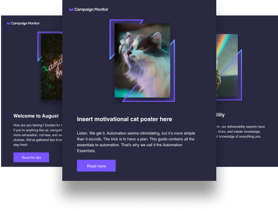
4. Text-to-image ratio
 Source: Campaign Monitor
Visuals should be used primarily to illustrate the text content—they aren’t the focus of the newsletters.
There’s a reason why: Emails that are largely visual based run the risk of slowing load times or being blocked from loading automatically.
To avoid this trap, ensure that your emails are 80% text and 20% visual.
If your email has to be one image, add text at the bottom, such as an unsubscribe link, company address, and return policy to balance out the image.
5. Image sizes
Image sizes are taken into consideration when optimizing websites, but they also have a role to play in creating email campaigns.
Heavy image sizes could slow down the loading speed of your email, as it would a website. But, if your image size is too small, the quality could be badly affected.
A high-res image shouldn’t be resized ham-handedly, since it could distort or pixelate the image and, with so many emails clogging people’s inboxes, a distorted image could be what drives them to click away from your email and turn to someone else’s.
Keep your image sizes small—no more than 1MB each, with a resolution of at least 72 PPI to make it viewable on multiple screen sizes.
Learn to edit images in your Campaign Monitor emails.
6. Image formats
You can control the size of your email visuals by using the correct image format. Popular image file types include JPG, PNG, and GIF.
JPG images include a deeper level of detail—they’re better for photographs, in general—and tend not to have very large file sizes, but they also get compressed when uploaded.
PNGs work for all image formats—photos, illustrations, vectors, and more—and can be easily scaled without losing resolution. However, PNGs veer towards large image sizes.
GIFs have the smallest sizes among the three formats, which makes them ideal for quick-loading content. However, they can’t contain high-resolution graphics and distort easily.
Depending on the kind of content you’re creating for your emails, you’ll have to choose your image format.
JPGs are a sure-shot for emails, as long as you aren’t trying to resize the original image.
If you aren’t sure of the quality of the final email, send yourself test emails before distributing it to your database.
7. Alt-text
Alt-text isn’t just for websites; they need to be added for emails as well.
We’ve already mentioned how most email servers automatically disable images in incoming emails if they aren’t from familiar sources.
When a recipient opens an email with blocked images, they need to see relevant text in the place of those images, so they know what it’s in relation to. This will encourage them to turn on the images and engage with the emails.
Alt-text is also necessary when transmitting emails to people with visual impairments, since they’ll likely have screen readers that read out the alt-text to them.
For these reasons, you need to give your images relevant alt-text that describes what’s in the image.
8. Make visuals clickable.
Don’t just make the “read more” tags clickable in your emails; make the entire associated visual clickable to improve click-through rates.
Making email visuals clickable improves your chances of elements being clicked on, as mobile marketing is soaring and more emails are being viewed on small devices.
Text, even when well sized, can be difficult to click on, unlike an image, which takes up more space and is easier to cover with a finger.
Your outbound links from emails should be highlighted and included in images for better traction.
9. White space

Source: Campaign Monitor
Business newsletters often pack in a lot of information. You have limited space to work with, so you want to put in as much as possible, albeit in an organized way.
But more isn’t always better, especially in the world of email marketing.
You need to use white space in your emails to improve readability, for clarity, and to make your content look more attractive.
If you look at these email poster design examples, you’ll see how well white space amplifies the messaging of a visual email. Less really is more with regard to emails.
Organize the visuals of your email into a distinctive hierarchy and ensure that there’s plenty of white space around the visuals and text for easy reading.
10. Bullet points
Speaking of white space, an excellent way to ensure you have plenty of space around your text and visuals is to use bullet points.
Not only does this immediately create more space around your content, but, with the creative use of icons, you can elevate your email to something more memorable.
Don’t be afraid of using bullet points—they aren’t only meant for “serious” journals and articles; bullet points can be visually appealing as well.
11. Powerful branding

Source: Campaign Monitor
Branding is a must in the visual world. How else will your audience know that the content comes from you and not someone else?
But this doesn’t necessarily mean stamping your logo all over your email.
Don’t rely on your logo to carry the burden of branding your email. It’s a strong visual, but it can be overwhelming and distracting for the audience.
Instead, use more subtle visual cues for your branding. Your company should already have a distinctive brand identity, including colors, tone of voice, and font use.
Incorporate all these elements of your brand identity to make an impact on recipients.
For example, choose images that use the colors of your brand and fonts that match your brand’s fonts.
The tone of voice in your emails should be quintessentially you. Don’t change the tone from what your company’s been adopting across other platforms.
Using multiple tones in your omnichannel campaigns will confuse audiences and likely lead to less engagement.
12. Interactivity

If you look at these email design examples, you’ll notice something: Interactive emails are more attractive.
An interactive newsletter gives recipients more reason to stay on your newsletter and to click through to your website.
A simple way of adding interactivity to your newsletter is by including a GIF or two, but, as we’ve already mentioned here, avoid over-using GIFs, as they’ll become tired.
Simple animations are great for making your newsletter interactive (a single button can be animated to improve engagement). Interactivity is a great way to boost retention, but only if it’s relevant to the subject of the email and the visuals you’ve used.
13. Font use
Fonts can be useful visual tools, and many marketers don’t realize that. Using artistic fonts—such as these creative headline fonts—can make as strong an impact as an image.
But it’s best not to use creative fonts throughout the body of your email, as it’ll strain the eyes and could make your content unreadable.
Instead, consider creative fonts as an alternative to images and use them sparingly in your email to create the same impact without the strain.
14. CTA placement

CTA placement is a point of contention for marketers. Should it be placed at the top or at the bottom? That’s assuming you only have one CTA. Should you have more?
Your newsletter should have one primary goal, but you can still have more links embedded in the email.
Plan out the one overarching goal for your email: Are you driving traffic to a new product line, a new blog, or your new contest?
That CTA should be placed at the top because, the higher your CTA, the easier it is for recipients to note what they have to do with the email.
You can have more links below the main CTA, but they should be of less impact than the primary action you want people to perform.
15. Responsive visuals
More emails are being viewed on mobile devices, which means visuals need to be designed for small viewing screens.
The newsletter format should be vertical for ease of scrolling. Think of the way users are handling their devices: They scroll with their thumb, and vertical scrolling is easier than horizontal.
The visuals you choose shouldn’t be too large or too small because, if the image is too big, it won’t resize properly for the smaller screen. If it’s too small, it’ll be hard to decipher.
Marketers must also remember that emails are still viewed on desktops and laptops, so decreasing the size of images too much may lead to poor-quality emails on large screens.
Look at the instructions provided by your email client; the software will give you the acceptable length and breadth of the visuals and newsletter. Don’t stray from these dimensions.
And, once again, always send yourself test emails, so you can see what the final product looks like before sending it through to your list.
Wrap up
Visuals can have a massive impact on how well your content is engaged with, but it’s important to remember that visuals should only be used when needed.
If your message can be shared through a text email, don’t force an image in just because images gain attention—you’ll end up distracting from your core message.
But, when you do have a visual that shares your message, use it and keep in mind the points we’ve made in this article.
It’ll take practice, but, by A/B testing often and noting those results, you’ll be able to revamp your email marketing for stronger results.
 Ronita Mohan is a content marketer at Venngage, the online infographic maker and design platform. Ronita enjoys writing about visual content marketing, business development, pop culture, and diversity.
Twitter: @Venngage