Article first published in September 2014, updated July 2019
Almost 5% of the population is color blind. To put this into perspective, that’s roughly the same number of people who use Outlook.com or Yahoo! Mail. Yet despite this prevalence, remarkably little has been said about how to choose colors for accessibility.
To give you an idea of how email newsletters are seen by people with color vision deficiencies, we’ve simulated what a variety of email newsletters would look like to those with red-green color blindness and deuteranopia. Along the way, we’ll provide some practical tips to help you create more accessible email designs.
How common is color blindness?
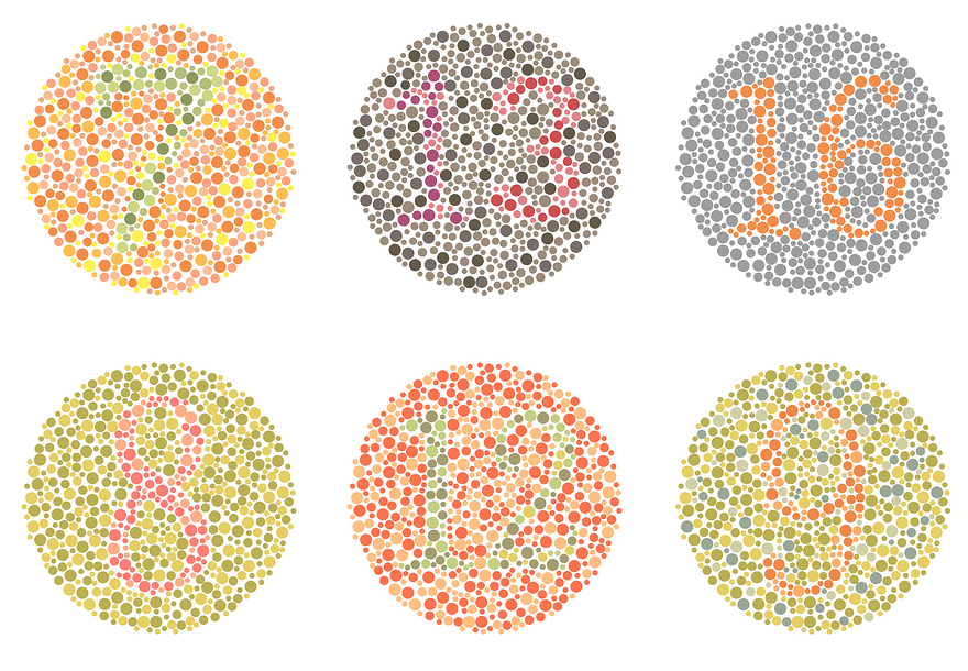
Can you find the numbers on these six plates? If so, then you may be fortunate enough to not be one of the 2.7 million people (4.5% of the entire population) affected by color blindness as judged by the Ishihara Test, a color perception test consisting of 24 – 38 plates like the ones above.
The reason there are so many different tests is that there are several different types of color blindness. 99% of color blind people can see some color – complete color blindness (also known as monochromacy) is actually quite rare. The most common type of color blindness is red-green color blindness, also known as protanopia. People who experience this do not see a complete lack of color where reds and greens appear, but instead, they have a harder time distinguishing the two colors from each other as the reds will look like greens.
If 4.5% of the entire population is affected by color blindness, then it is definitely something you should consider in all design projects – including email design work. And it’s especially true if your target audience is male, since 8% (1 out of 12) experience red-green color blindness, compared to 1 out of 200 women. It’s one of the reasons that Facebook is blue – because founder Mark Zuckerberg experiences red-green color blindness, thus making blue the color he sees best.
How email newsletters appear to the color blind
Designing with color blindness in mind does not mean removing color completely from the picture, but it does mean taking into consideration the areas you want to truly stand out. Let’s take an example newsletter design run through a color blindness simulator. Here’s a comparison of a very-colorful email would look to those with red-green color blindness:
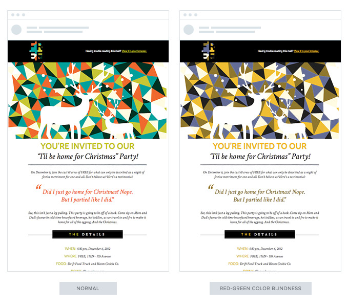
As you can see, the email is still legible. The only difference is the areas with red no longer pop like they did before. And speaking of a loss of pop, look at this comparison, with the example on the right as seen through the eyes of someone who cannot distinguish greens and purplish-reds – a rarer color blindness also known as deuteranopia:
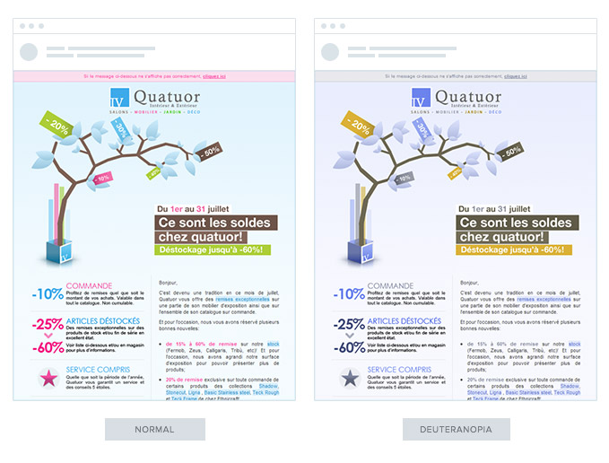
Again, while it’s still legible, it loses a lot of its contrast. It’s most especially noticeable with the text that was meant to stand out in pink. These are the things you need to know when highlighting specific portions of your email content with color, on colored backgrounds.
Best practices for designing email for color blind audiences
While the differences in how your color blind audience sees your email messages can be dramatic, designing for the color blind can be done without revamping existing color schemes. Just follow these tips:
1. Do not try to convey specific messages through color alone
Considering the above, here’s an example of what red and green selection buttons would look like to someone with red-green color blindness:

The text may be helpful in distinguishing the choices, but it goes without saying that at first glance, it’s confusing as to which option you should choose. Likewise, when offering a product in a variety of colors, adding labels beneath each of the options means that someone with color blindness will have less trouble determining what to choose amongst the group.
2. Make sure text stands out on colored backgrounds.
As a general rule, you don’t want to use one shade of red text on top of another shade of red, regardless of whether you are considering design for a color-blind audience. If you find the text a little difficult to read, someone who finds it difficult to distinguish reds will have troubles as well. The more contrast between your text and your background, the better for all audiences.
3. Go monochrome
While you don’t have to go black and white, sticking to one shade of color in your emails can help. Observe this original email in purple (center), with variations simulating red-green (left) and blue-yellow (right) color blindness:
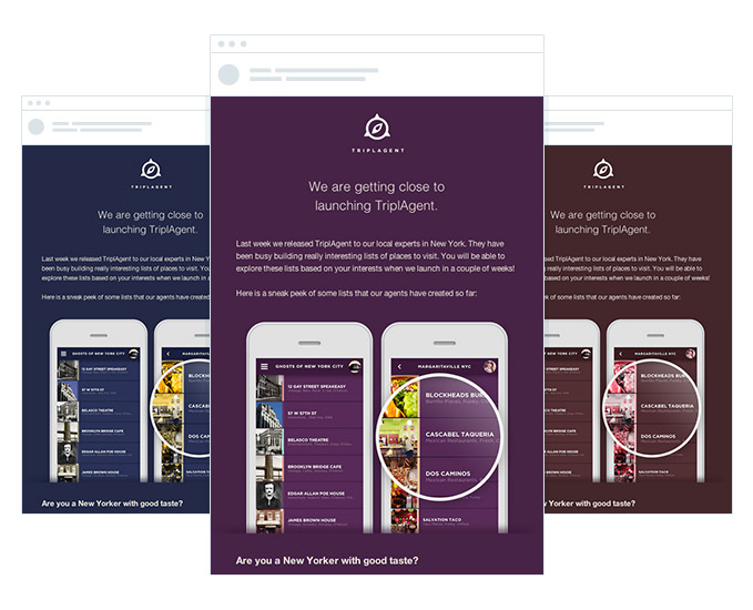
As you can see, the design looks stunning. By designing monochromatically, you can easily see how well your text and calls to action stand out without wondering if one shade of color is distinguishable from another.
4. Test your email designs
In addition to the color blindness simulator that you can use to upload images to see them through the eyes of specific color blindness types, Mac users can install an app called Color Oracle. This will place a toggle at the top of your menu bar that allows you to change your entire screen resolution to that of one specific type of color blindness:
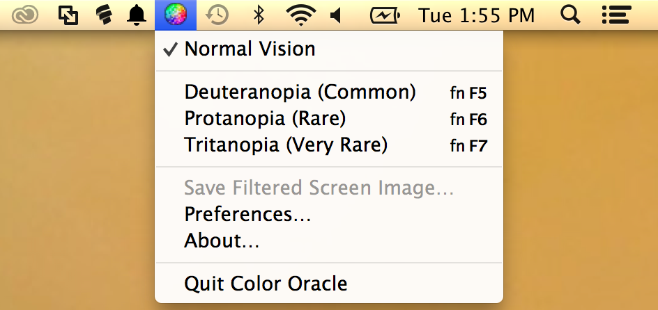
Instead of having to take screenshots, you can view your current design through a specific color blindness type and edit accordingly. It’s also a great way to preview images, especially prior to purchasing stock photography or using image backgrounds for your buttons.
Knowing how well your call to action button will stand out from your email newsletter’s background is just as important as checking the readability of your main email content. For example, if you have a green button on a red background, it will not stand out to someone with red/green color blindness. You will want to make sure, at a minimum, the contrast between the button and the background are distinguishable. All it takes is adding a different color border around the button, such as the silver borders around the help and act now buttons above.
As you’re editing your emails for color accessibility, remember that the same rules can be applied to the pages you want your visitors to click through to. Don’t lose conversions because your email works for the color blind, but the landing pages they are directed to are confusing.
In summary, by considering your color blind subscribers, you’ll not only be a nice person but increase the likelihood of everyone having the chance to read and respond to your messages as intended. Hopefully, after reading this post, you’ll understand what a difference a color-accessible theme throughout your campaigns and landing pages can make.
How to design for accessibility
In the past, digital marketing was not geared towards those with disabilities such as blindness and vision impairment. However, as technology continues to advance, many platforms have made strides to become more inclusive towards supporting those with needs.
If you don’t believe this is important, you’re missing the boat. In fact, 285 million people across the globe have visual disabilities.
Email accessibility affects millions of people every day—including your customers—so ensuring that your emails follow the correct guidelines to make your message receptive to all is vital. Accessible emails mean that your subscribers with disabilities can read, access, and interact with your content better. That’s a win-win for everyone!
Let’s take a look at how you can utilize accessibility design guidelines to create more inclusive emails for all your subscribers.
Should color and design be used in email?
If you’re thinking about totally scratching color and design to be more compliant for your subscribers—hold up. Designing accessible emails benefit of all your subscribers as you provide more logical content—but that doesn’t mean you have to lose your branding.
While you don’t need to eliminate the creativity that sets your messaging apart, you should follow accessibility requirements which include organizing your layout, utilizing contrasting colors, and designing clean code.
What are the accessibility requirements?
First things first, you need to understand how emails can meet basic accessibility requirements. Your emails must follow these guidelines:
- Include a logical reading order: Email content needs to assembled left-to-right and top-to-bottom.
- Order heading elements in code: Keep a consistent hierarchy by using <h1>, <table>, etc. code so the information stays in the correct order.
- Include contrast between background colors and text: As many people are sensitive to color, the background and text need to contrast enough to be readable.
- Alternative image text: Describe what the image is with alt text.
- Feature informative link text: Link text tells people what the link will be once clicked—‘read more’ is not enough.
- Code concisely: Messy code often leads to longer load times and can have unexpected display results.
- Write an informative subject line: This string of text works as the first impression of the email and will determine if the email is relevant to the subscriber.
Source: Really Food Emails
Take this example from YouTube, which is known for its initiatives to support those with disabilities. The email has all the content displayed on a white background so it’s easy to read with contrasting red icons and links. It also logically flows from left to right and the CTA tells the subscriber what to expect once they move out of the email.
Wrap up
Designing your emails for colorblindness and accessibility is vital to ensure your marketing materials are as accessible as possible. Luckily, it only takes a few small changes to your emails to make them more user-friendly for everyone on your list.
Here are a few more best practices to follow:
- Use a large and readable font
- Keep the content short and simple
- Embrace white space
- Offer a text-only preference
- Highlight links in another color
Start making your emails for inclusive for all your subscribers today to start harnessing more brand loyalty, engagement, and overall usability. Discover more email best practices to continue creating the best emails for your audience.


