8 minute read time
How Color Choices in Your Email Impact Engagement and Conversions
There are—quite literally—millions of colors that the human eye can perceive. That means there are innumerable color palettes people can use to communicate their feelings or desires.
Color psychology can be an effective strategy for email marketing, but with all of the possible color options and the multitude of human emotions, it can be challenging to figure out where to start.
You might be wondering how color choices in your email impact engagement and conversions. Colors can influence behavior, so it’s worth understanding how that works.
Before you craft your next email campaign, review this guide to making the right color choices in your marketing efforts.
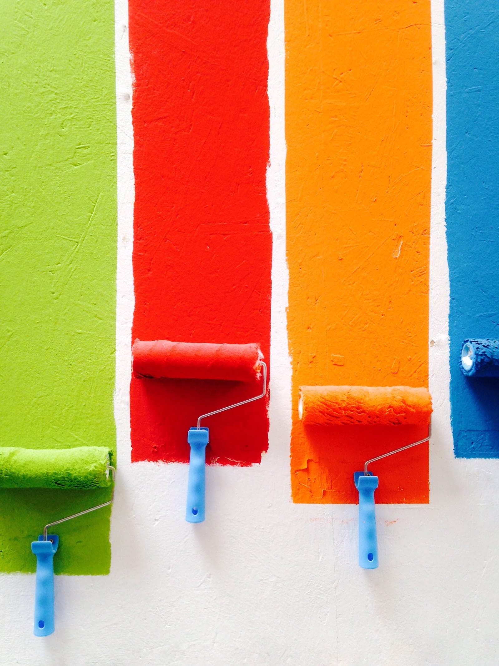
How is color associated with feelings and decision-making?
Color psychology is a fascinating study that looks at how color influences the way people feel and act. Colors often appear differently from person to person, but each color is associated with a different set of emotions or perceptions.
In the United States, colors can be a powerful tool for driving behavior. Common color psychology associations include:
- Black: a color associated with luxury and impulse, black conveys a sense of power and status.
- Blue: often used by financial institutions and businesses, blue exudes a sense of trust and security.
- Green: the easiest color for your eyes to process, green is associated with wealth and relaxation.
- Orange: an appeal to aggressive impulses, orange is the color for your CTAs.
- Pink: marketed toward traditional shoppers, pink marks romance and femininity.
- Purple: sometimes associated with royalty, purple is both calming and soothing.
- Red: projecting energy and a sense of urgency, red increases the heart rate.
- Yellow: conveying optimism and youthfulness, yellow is the color to grab attention.
This is an important consideration for email design—it’s also something to consider for your logo, other marketing copy, products, and website.
How color choices in your email impact engagement and conversions
Beyond basic color psychology, color and email design are critical to driving engagement and conversions. They have the potential to sway customer emotions and encourage them to purchase your products or services.
Color can measurably influence your conversion rates through:
- Brand awareness: your brand is critical to your business, which means your logo is too. Using the right colors in your logo and marketing copy can inspire consumer confidence, and it leads to an 80% increase in brand recognition. In some cases, brands even trademark unique colors.
- Product marketing: the color of the products you sell and your marketing copy are as important as your logo. Product color is the primary reason that 85% of shoppers purchase specific products, while visual appearance, in general, is the most important factor in their decisions.
- Click rates: a popular A/B test from a few years ago measured how the color of a button impacts the click rates in an email. The test looked at the green and red CTA buttons that lead to the same landing page. The green button had 21% more clicks than the red button.
With such a significant impact on buyer decisions, color psychology plays a crucial role in influencing your customers. It permeates every aspect of your business’s marketing efforts.
Examples of how color choices in your email impact engagement and conversions
Between the significance of color choices and the impact of color on emotions, you’re probably wondering how to approach email design. Review these examples of how color choices in your email impact engagement and conversions.
1. Casper: building trust and security in blue
Blue, which is a cool color that creates a sense of security, is one of the most common colors used by big brands and email marketers. However, it can also lead to feelings of sadness, so you need to be careful about how you use it. Check out this example from Casper, a mattress company whose brand uses the color blue—a nod to nighttime—in all of their email campaigns and marketing copy:
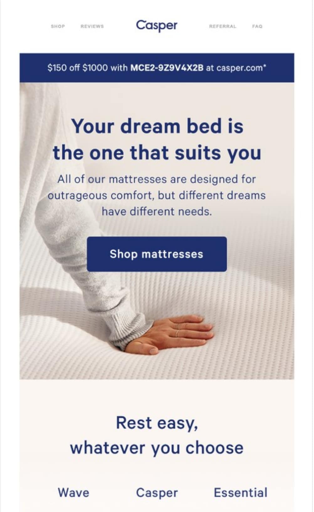
Source: Really Good Emails
Takeaway: blue, which is the color of choice for big names like Ford, Samsung, Chase Bank, and Facebook, is a popular choice for brands with a global customer base. Use it in emails when you want to build trust in your organization.
2. REI: summiting mountains in earthy tones
Not every brand is so easily recognizable by color, but they might use it wisely in their email campaigns. REI is a popular outdoor gear company that sends out marketing campaigns highlighting new products, upcoming events, and outdoor news. Since they use a lot of images that feature majestic landscapes and gear in bold colors, they stick with a neutral background and palette to keep the email clean.

Source: Really Good Emails
Takeaway: while neutral colors like brown aren’t exactly exciting and don’t call up any strong feelings, they are appropriate when you’re incorporating graphics that might clash with vibrant hues. Use your email content as a guide to choose the best palette.
3. Taco Bell: big brand recognition in purple
Though purple is one of the least-liked colors by men, that doesn’t mean it’s off-limits when you want to appeal to a wide audience. If you’re one of the few in your industry using a specific color, as is the case with Taco Bell and the fast food industry, it can help bolster your brand recognition. Take this example from what’s arguably one of the most popular fast-food chains in the United States:

Source: Really Good Emails
Takeaway: while things like biology, gender, and our attachment to objects of a certain color can impact our feelings, culture, experience, and context can all influence how you perceive color. It’s okay to break the mold and get creative with your color palettes when it makes sense.
4. Barnes & Noble: easy relaxation in green
To some people, green can inspire images and feelings associated with the outdoors, but, to others, the color is relaxing. Capitalizing on the relaxation element, Barnes & Noble uses its signature green color in all of their email and marketing copy. Since many people feel that reading is relaxing, the use of green is particularly compelling in this email example:

Source: Really Good Emails
Takeaway: the correct application of color will vary from business to business, industry to industry, audience to audience. Find ways to match your color palette with your brand’s purpose, as Barnes & Noble did by using green to inspire relaxation among readers.
Best practices for using color in your email marketing campaigns
If you’re new to using color psychology, you might be unsure of where you should start. Color can be intimidating to some people, and, if used incorrectly, it can be jarring and unappealing to your audience.
Before you create your next email campaign, review these best practices for using color in your marketing emails:
- Understand your audience: Culture, texture, and context all impact how your audience perceives color. While purple represents royalty in many countries, it can represent death in Italy, for example. Gender is another area where color can make a difference. Purple is a common favorite color among women but is one of the least-liked colors by men.
- Narrow your palette: Depending on factors like your logo and other images, you may want to use more than one color. This can be a great way to grab your reader’s attention, but it can also be overwhelming. A common approach is to use the 60:30:10 rule, where 60% of your palette is a single color, usually neutral, 30% is a complementary color and 10% is an accent color.
- Test your email campaigns: Even the best email marketers need to see how their email campaigns perform. You can use A/B testing to determine which colors generate the most clicks and which lead to the most conversions. If you segment your lists, you might find different click and conversion rates for different lists. This is a critical step in determining your future email strategy.
These color psychology best practices will help guide you through the process of creating your next email campaign.
Wrap up
Using color to influence your customers’ behaviors can be challenging. There are thousands of shades, hues, and tones, and there are dozens of factors that impact how your audience perceives color. Fortunately, you can use these key takeaways to enhance your color psychology strategy:
- Determine the tone and voice of your email campaign before you narrow down a palette.
- Use color to solidify brand awareness and complement the other graphics you use.
- Explore using blocks of color, vibrant CTAs, and bold buttons in your email campaigns.
Even if you prefer to send simple, black-and-white emails, you can add pops of color to help boost site traffic and improve your conversion rates.
Want a tool that can help you measure the results of your email campaigns? Campaign Monitor has powerful tools you can use to A/B test your email color choices.