*post updated January 15, 2019*
At a time when one popular web design trend is simplicity, it’s tempting to apply the same minimalism to email. Less is more. The fewer prompts the better. But does this result in more click throughs or are we simply prioritizing form over function?
I started asking these questions after attending a talk on essentialism, or the disciplined pursuit of less but better. Championed by Plato, Gandhi, and Steve Jobs, it’s an idea loaded with promise and, allegedly, few downsides; the essentialist spends their time on meaningful projects, travels light, and designs the most spartan of email campaigns.
The problem, of course, is that while it’s attractive to think that less links in an email campaign (and less surrounding content clutter) should result in higher engagement, we’ve never looked at the numbers.
That is, until now.
A case for more
Our hypothesis was that HTML email campaigns with less unique URLs and/or links would have a higher click rate (% click/open) than those with more. To test this theory, we looked at the behavior of over 500 million email recipients from email campaigns sent to over 500 subscribers in recent months.
Each email campaign was categorized by unique URLs and links therein in order for us to determine whether having less to click on resulted in a more engaging email experience.
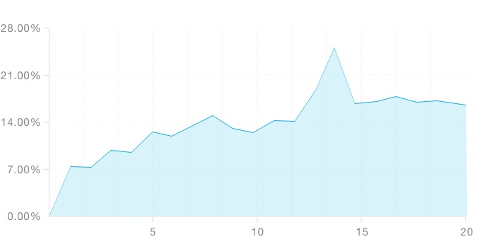
Here’s how the percentage of clicks perform as the number of links increase in email campaigns:
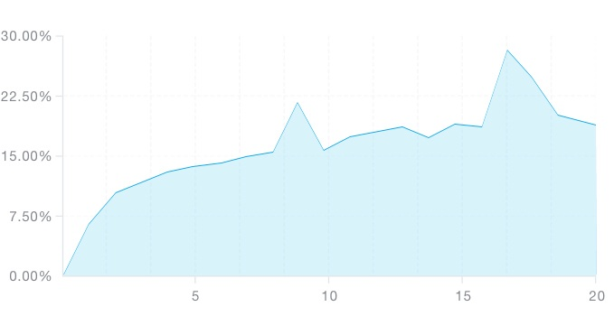
For comparison, here’s how click rates perform as unique URLs increase:
Here are the results:
As it turns out, increasing the number of unique links and URLs has a strong positive effect on click rate until you reach 11 or so. After which, the click-through rate see-saws around the 17% mark, but never really takes a dive.
So overall, our results show that the more links, the higher the click rate.
This is upsetting for anyone who dotes on the single call-to-action approach to email design, or worse still, has a client intent on packing in an extreme amount of content.
The other thing worth noting is the relationship between links and unsubscribes. Email campaigns with no links at all receive an unsubscribe rate of 0.45%, or roughly 55% more unsubscribes on average than those with 1 or more links. Unsubscribe links were excluded from our link total.
Did we just bury simplicity?
Like with many things, if you narrow your focus down to simply the numbers, you can come to some rather unappealing conclusions.
For example, having 10-20 links in an email campaign may at face value seem like it can “boost” your click rate. However, we know this many links can potentially come at the expense of having an unfocused message.
In order to make the most of your links and CTAs, you need to be clear about your goal and follow the basic principles of email marketing best practices.
If you have a newsletter with say, 6 different articles and a dozen links to choose from, you can increase the likelihood that any given recipient will find something relevant as long as you don’t overwhelm your reader.
If the purpose of your campaign is to drive traffic to anywhere on your website, this might be a great result for you.
More links
However, it’s easy for an email filled to the brim with links and CTAs to overwhelm your subscribers, even if you’ve optimized them for max performance. If you want to include multiple CTAs and get the best results from all of them, be sure you:
- Use action-oriented copy
- Make your button large, legible, and easy to use
- Add white space
- Use first-person language
- Create urgency
Here are three examples of emails that don’t sacrifice quality in order to increase the quantity of their CTAs:
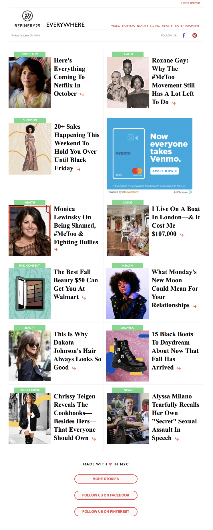
1. Refinery29
Refinery29 uses whitespace and clearly defined blocks to keep their CTAs easily clickable. The headlines also make it easy for readers to scan while standing in line for coffee or mid-commute.
Plus, this layout works on both mobile and desktop.
2. Nisolo
Despite the four different CTAs, this email works. The multiple options don’t confuse the reader or compete against one another for the reader’s attention. Instead, the different styles and corresponding links to shop are clearly defined and separated from one another.
And the final option—shop all bestsellers—quells any fear of missing out the reader might feel, causing them to panic and choose nothing, because they don’t have to miss out at all. If they click the final CTA, the subscriber can see all of them.
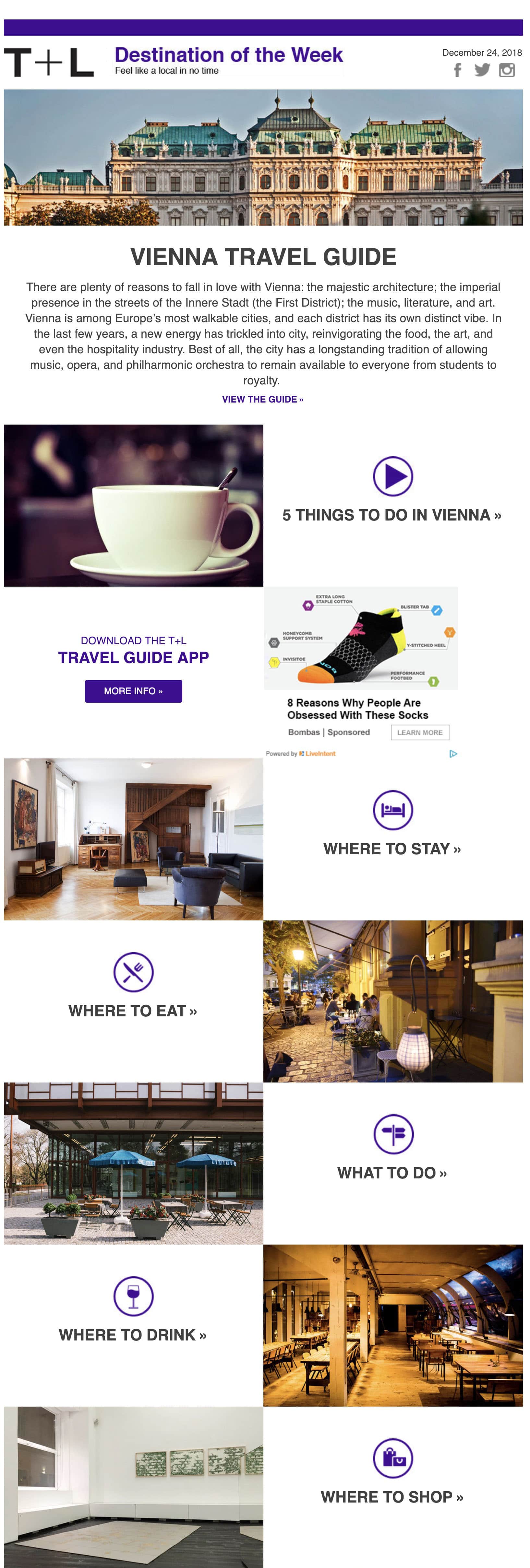
3. T + L Destination of the Week
This email sent by Travel + Leisure keeps their CTAs from confusing the reader by surrounding their CTAs with plenty of whitespace. Also a plus, they keep each one distinct while ensuring each CTA relates to the same theme, in this case, everything their readers need to know before visiting Vienna.
Alongside beautiful images that incite the reader’s curiosity, each link just waits to be tapped by your subscribers.
Less links
On the other hand, if you want everyone on your list to buy a specific product or sign up to a webinar, then having an overly-complicated email won’t get you any closer to your goal.
Instead, incorporate one killer CTA that uses these following tips to drive clicks to your page:
- Use bright colors
- Keep your text concise
- Keep your CTA above the fold
- Maintain focus on your primary CTA
- Follow a logical flow, from image to text to button, or whatever makes the most sense for your email
Here are a few examples that do exactly that:
1. 22 Days Nutrition
This email has one clear CTA encouraging subscribers to shop now. The command, paired with an enticing subject line, means that subscribers are more likely to click through to 22 Days’ website and ultimately make a purchase.
The CTAs to shop protein powders, protein bars, and the meal planner are clearly secondary—they’re located below the fold and they’re much smaller than the “shop now” feature—so they won’t distract from the main goal of the campaign, which appears to be get people shopping with their mystery promo code.
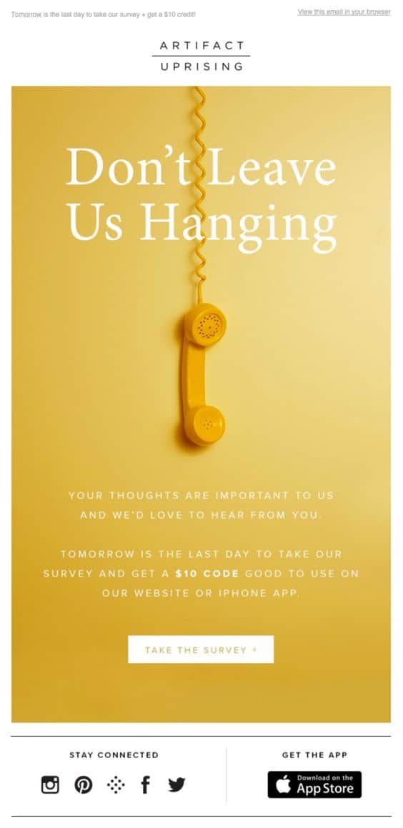
2. Artifact Uprising
This email from Artifact Uprising leaves no doubt what it wants subscribers to do: take the survey. Though the CTA might be lower in the email, because it’s the only thing going on, it’s impossible for subscribers to miss.
The CTA fits with the rest of the design elements and the white background stands out from the yellow email. The text is short and sweet, meaning your readers can understand this email—and follow through with the CTA—in a glance.
If the website is optimized for quick and easy conversions, these subscribers could potentially open the email, glance at it, click through, and take the survey in a matter of seconds.
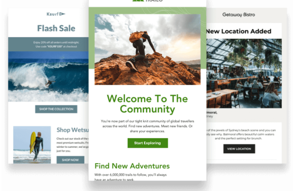
3. Stay Golden
This welcome email from Stay Golden provides another example of an email with only one or two CTAs that packs a punch. The overall goal of this email is to welcome subscribers after they initially sign-up to the email list, as you can see for yourself.
The option to “see the menu” is a great way to convert fans of your brand into paying customers at the time when they’re most excited about you. For Stay Golden, this means connecting their customers to the menu so they’re even more likely to stop by. If their new subscriber reads all the way through but hasn’t clicked, they have a final option to check out their coffee newsletter.
Wrap up
So, our takeaway here is, use links. In fact, use multiple links. But stay focused on your message and don’t let your readers get lost. Most likely you have a specific goal in mind when strategizing, so be sure your design reflects that.
And whatever you do, don’t let your unsubscribe link be the only one in your email.
HubSpot emphasized finding a “middle ground” in their blog:
It’s never a bad idea to include multiple links in an email, since each link is a call-to-action that could reconvert your email recipient. That said, you don’t want those calls-to-action to compete with one another, which is why it’s crucial that you decide exactly what it is you want your email recipient to do upon receiving your email.
Now that you’ve seen the numbers, what do you think? Should senders be deliberate about how many links they use?
Let us know your thoughts in the comments below.

