8 minute read time
The Anatomy of a High-Converting Signup Form (with Examples!)

A look at the elements that make up a high-converting signup form, and some amazing signup form examples.
Do you want to grow your email list?
The first (and simplest) step to attracting more subscribers is to optimize your email signup form. This form is more than a routine necessity to collect email addresses; it’s an opportunity to make signing up for your emails feel easy and good.
An optimized signup form reduces friction in the signup process and can lead to more subscribers. On the other hand, a poorly engineered signup form can feel like a barrier for potential new subscribers and decrease signup rates.
In this article, we’re explaining the 10 best practices for building a successful email signup form, and looking at some amazing signup form examples.
10 elements of a successful signup form (with examples)
1. Start with goals
You can’t create a successful strategy for anything (including your signup form) without clarity around your end goals.
Why do you want to collect email addresses and grow your email list? Who do you want to attract to your list? Why do you want them to join? What do you hope they will get out of joining your email list?
Answering these questions will help you design a signup form that attracts the right subscribers and primes them to engage. On the practical side, knowing your goals will guide which fields you ask subscribers to fill out and the messaging you use for your form.
For example, nebo, a digital agency, includes a signup form prominently on their website. Their goal with their signup form is to attract potential paying clients, not just subscribers. To this end, they…
- Make their form as frictionless as possible so as to not harm conversions
- Include a field asking about the subscriber’s project to indicate that the type of person to subscribe should be interested in working with this agency
- Add copy that speaks to the possibility of an ongoing relationship (“Let’s get started!”)

For a different example, let’s look at Zendesk’s email signup form. Zendesk offers a free demo in exchange for signing up to their email list. This likely means that their goal is to nurture new subscribers via email to eventually convert them into paying customers (rather than asking them to become paying customers right away, like nebo does).

To support this goal, Zendesk…
- Strategically offers a demo as their email capture to ensure new subscribers are at least somewhat interested in the paid product
- Reduces friction with a simple, three-field form
- Asks specifically for the subscriber’s “work email” to ensure that their emails reach the subscriber at work, when they make software purchasing decisions
2. Design that counts
Your email signup form is a key touchpoint with people new to your brand. As such, it’s important that you design the form in line with the rest of your visual branding. Consistent branding has been shown to inspire trust with consumers and even increase revenue by as much as 33%.
When it comes to your signup form, consistent branding means choosing fonts, colors, and a design style that matches the rest of your online presence.
One person who aligns her email signup form with the rest of her branding is anti-racism educator Monique Melton. Her signup form uses her signature bright pink brand colors, no-nonsense font, and upbeat messaging:

3. Less is more
It can be appealing to ask for lots of information from subscribers because more information might lead to a better ability to segment or nurture your subscribers. However, we recommend a “less is more” approach when it comes to collecting information in your email signup forms.
Venture Harbour’s 2021 roundup of the latest studies on form length revealed that, in general, shorter forms performed better than longer forms. However, there were instances where the reverse was true. In some cases, longer forms converted better because the fields were fun to engage with. In others, longer forms led to more engaged subscribers, presumably because those who joined were those who wanted to join so badly they were willing to fill out multiple fields.
Bottom line? The length of your form will depend on who your subscribers are. Adopt a “less is more” mindset with your signup form, and if you include multiple fields, make sure it’s for the benefit of the subscriber and not only for your benefit.
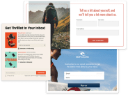
For instance, this signup form example from Star Trek fan website Trekland adds a question about the subscriber’s favorite Star Trek. Though not “needed”, this is a field that subscribers will delight in answering and so contributes to a positive user experience.

4. Keep it simple
Keep the messaging related to your signup form as simple as possible.
Marketing Experiments tested whether adding more persuasive copy to a nonprofit’s donation form would increase donations. Though it might seem like sharing more about the benefits would drive up conversions, the result was the opposite. The form with more copy had a 28% lower conversion rate than the donation form without any persuasive copy.
One organization keeping it simple is the Los Angeles Conservancy. Their signup form is presented with the need-to-know information in a short paragraph at the top.

5. Mobile friendly
Ensure your form is easily completed on a mobile device. In 2020, 61% of all website visits occurred on a mobile device, so it’s likely that many subscribers will be filling out your form from their smartphone.
A mobile-friendly form is responsive, adapting to the screen size on which it’s being read, so the subscriber doesn’t have to zoom in or scroll around to see all the fields. To make this easier for your development team, opt for a simple single-column design.
The LaBelle Foundation uses a responsive form design that adapts from their desktop version to render clearly on mobile.
Desktop form:

Mobile form:

6. Good incentives
Consumers are used to being asked for their email address daily from different organizations and may be wary of providing their email without a good reason to. So, it’s crucial that you offer a great incentive, otherwise known as a lead magnet, in exchange for a subscriber’s email address.
Common incentives include a discount, a free gift, a free download (such as an ebook), a quiz, or a content upgrade.
For example, e-commerce website FarmGirl Flowers offers a 10% discount as an incentive for subscribing to their list:

7. Clear dropdowns or multiple choice
Dropdown or multiple-choice option fields offer a way to collect additional information from subscribers while making it as easy as possible for them to respond.
Also, offering multiple-choice selections means that you control what information the subscriber inputs, which makes it easy for you to segment them accordingly into predetermined categories.
For example, Role Models does this well on their email signup form. They include multiple-choice options for subscribers to select the age range of their child. Role Models can then easily segment the subscriber into a particular age range and target them with emails that will be most beneficial to that age range.

8. Submit buttons
The submit button is the last step in the conversion process. It’s a great opportunity to make signing up for your list feel fun, on-brand, or urgent — anything other than feeling like filling out a boring form.
So, we don’t recommend using the text “submit” on your submit button. Instead, optimize this final conversion step with something that appeals to the subscriber and makes them feel excited about completing the signup process.
For example, in this signup form example, copywriting company Damn Write features button text that reads “BRING IT ON!” to create a sense of excitement to signing up for her email list:

9. Double opt-ins
A double opt-in is when you ask subscribers to confirm their email addresses before officially adding them to your list.
Including a double opt-in after someone subscribes via your form reduces the possibility of getting spam email addresses on your list and increases your engagement rates later on. The extra step of confirming their email address means that only people who genuinely want to be on your list end up on your list.
Usually, the double opt-in occurs via email after the signup form. For instance, Shopify sends this double opt-in email:

10. Easy to find
Make sure your signup form is easy to find on your website. Instead of hiding your signup form in your footer, we recommend placing your signup form in a more prominent place, such as…
- In your website header
- In your website navigation
- As a popup
- In a noticeable section mid-webpage
For instance, podcast The Enlightened Executive includes their form in a large standalone section on their podcast webpage where it’s unlikely to be missed:

Wrap up
Your email list growth depends on the strength of your email signup strategy, which includes your signup form.
To create a winning signup form that drives conversions and attracts engaged subscribers, start by optimizing these 10 elements.
When you’re ready to create your own custom email signup form, try our seamless signup form builder.