8 minute read time
CSS3 Animation, SVG Masks, Web Fonts and More in Panic’s Newsletter
Article first published July 2013, updated June 2019
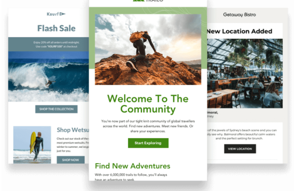
If you were fortunate enough to read Panic’s latest email newsletter, a couple of unique effects may have caught your eye. Pretty colors aside, we’ll show you how Panic used animation, a responsive layout, and other attention-grabbing techniques to create yet another truly memorable email campaign.
But, first, a little backstory. Like a lot of folks in the web community, we’ve always enjoyed Panic’s ability to truly push the envelope, not just with their Mac software, but with their email campaigns too. From their genial product updates to their re-engagement campaigns, each of their campaigns almost always provides a little instruction to email senders. Of course, it helps that the vast majority of their subscribers read their email in Apple’s OSX and iOS Mail clients—which means a limited selection of devices to test across and, thanks to WebKit, excellent CSS support. So, more than most, Panic can experiment with -webkit prefixed properties and other CSS tricks, as long as they degrade gracefully elsewhere, of course.
For the curious, Panic has created this email from a template, using our template language, and this campaign really goes to show how flexible templates can be.
Without any further deliberation, here are some of the highlights from their latest mailer.
Using CSS3 animation to create a “Ken Burns effect”
We’ve previously looked into using CSS3 animation in email and even went as far as creating a Christmas email template, featuring a sprinkling of CSS snow. However, here, Panic has done a great job at applying a tidy Ken Burns effect to their images, which will likely be replicated by many a sender. For the benefit of those who may have browsers that don’t support @-webkit-keyframes.
The HTML and CSS behind this on-load effect is straightforward. Here’s an abridged snippet:
CSS:
@-webkit-keyframes kennethburns {
   from { -webkit-transform: scale(1.5) }
   to { -webkit-transform: scale(1) }
}

div.screenshot img {
   -webkit-animation: kennethburns 5s ease-out;
}
HTML:
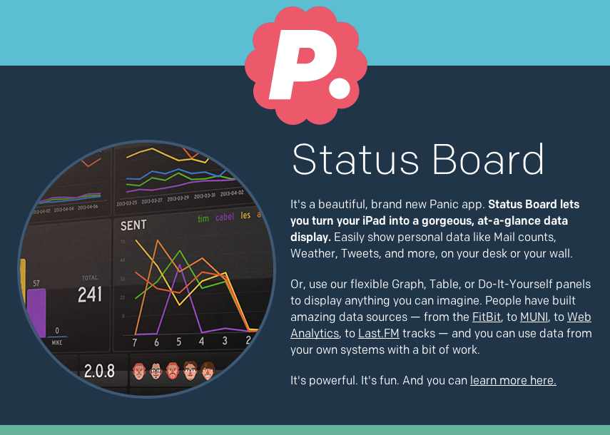
<div class="screenshot">
   <img src="status-board.jpg" width="355" alt="Status Board Looks Like This!" />
</div>
All that’s being done here is the image is being scaled down over a five-second period. You may wonder why the images remain neatly cropped within the circle (instead of, say, the circle also changing size). We’ll cover this in the next section.
What is a mask image?
Perhaps more than the use of animation, seeing image masks in email got us fairly excited.
Using SVG image masks
In essence, to allow the images to scale in that Ken Burns style, while retaining set dimensions in their newsletter, an SVG image mask has been applied using the -webkit-mask-image (again, adapted for brevity):
<div class="screenshot2" style="-webkit-mask-image:url(data:image/svg+xml;base64,PD94b…);">
         <img src="status-board.jpg" width="355" alt="Status Board Looks Like This!" />
</div>
As we don’t currently support .svg images, base64 encoding has been used to provide the SVG image.
How do I crop an image using CSS?
At this point, you may be wondering if they have a fallback for email clients that don’t support these techniques—and, yes, they do. Using both the border-radius and overflow CSS properties, the circular border and mask effect are sure to work in a few extra email clients, even when the animation doesn’t. And, when that fails, the original image should simply display, albeit unadorned. Here’s an expanded code snippet, featuring the image mask, fallback CSS properties, and border:
<div class="screenshot" style="border-color:#3b5875; width:355px; height:355px; border-style:solid; border-width:4px; border-radius:355px; overflow:hidden; display:block;">
   <div class="screenshot2" style="-webkit-mask-image:url(data:image/svg+xml;base64,PD94b…);">
         <img src="status-board.jpg" width="355" alt="Status Board Looks Like This!" />
   </div>
</div>
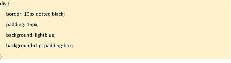
What is background-clip in css3?
The background-clip in css3 is the property that defines just how far the background color or image should extend within an element.
Not rough at all. We really hope to see these techniques used to add a little variety to email newsletters, instead of limiting ourselves to the usual rectangular images.
A fluid layout, Retina-optimized images and web fonts
On top of these techniques, Panic’s newsletter has employed a lovely fluid layout, which stretches across the full width of the viewport. As they’ve used large font sizes, paragraphs of text remain readable, even when the email newsletter is viewed in the browser. We’ve detailed how they’ve done this in a post on one of their previous newsletters.
Another thing—Panic has used an ample smattering of Retina-optimized images throughout their design. Employing a media query targeting high-resolution displays specifically, they’ve used the background-image CSS property to swap out regular images for 2x sized ones. Here’s a snippet of the code they’ve used to do this:
@media only screen and (-webkit-min-device-pixel-ratio: 2), (min-resolution: 192dpi) {
   body { background-image: url("https://.../topbar-2x.png") !important; }
   table#topnav td#globe { background-image: url("https://.../globe-2x.png") !important; }
   table#topnav td#tweet { background-image: url("https://.../tweet-2x.png") !important; }
...
}
While loading two times the images can add extra overheads, having detailed images (e.g., icons) or product photos display super-sharp on Retina displays really does look excellent. For more on optimizing images for hi-res displays, take a look at the Images section of our guide to Responsive Email Design.
How they implemented web fonts in email is worth mentioning. Instead of using Google Web Fonts and the @import rule to serve up their type (like we’ve previously suggested), they’ve used the @font-face rule instead and served up the fonts on their site:
@font-face
   {
      font-family: 'Chrono Regular';
      font-style: normal;
      font-weight: 400;
      src: local('Chrono Regular'),
         url("https://panic.com/.../ChronoWebMedium.eot")
         format('embedded-opentype'),
         url("https://panic.com/.../ChronoWebRegular.woff")
         format("woff");
}
This is fine in Apple’s email clients, but may not be as well-supported elsewhere. Thankfully, they provide a sturdy fallback: sans-serif.
As a final note, Panic sends very infrequently, so seeing one of their newsletters in your inbox almost feels like an event in itself. Telling folks to not send on a regular basis sounds rather counterintuitive, but, if your newsletters have a rap for valuable, interesting content and you subscribe to the idea of scarcity breeding demand, then you can potentially work this idea to your advantage.
Email templates for the win
Now, we understand that just the thought of CSS and HTML coding can be intimidating for many—and that’s okay.
At Campaign Monitor, we have a free email template builder to help marketers design stunning HTML email templates in under a minute. Users simply have to choose their favorite template from our gallery and customize from there.
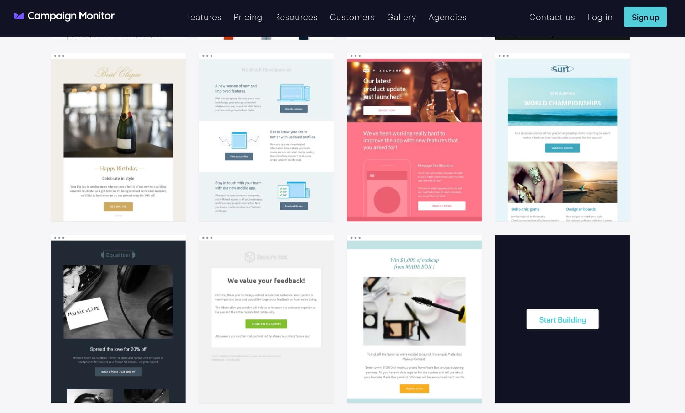
Source: Campaign Monitor
Thanks to our free email template builder, designing stunning HTML emails has never been easier. No coding knowledge is necessary to alter these designs. Users simply have to drag and drop to customize the email to their liking.
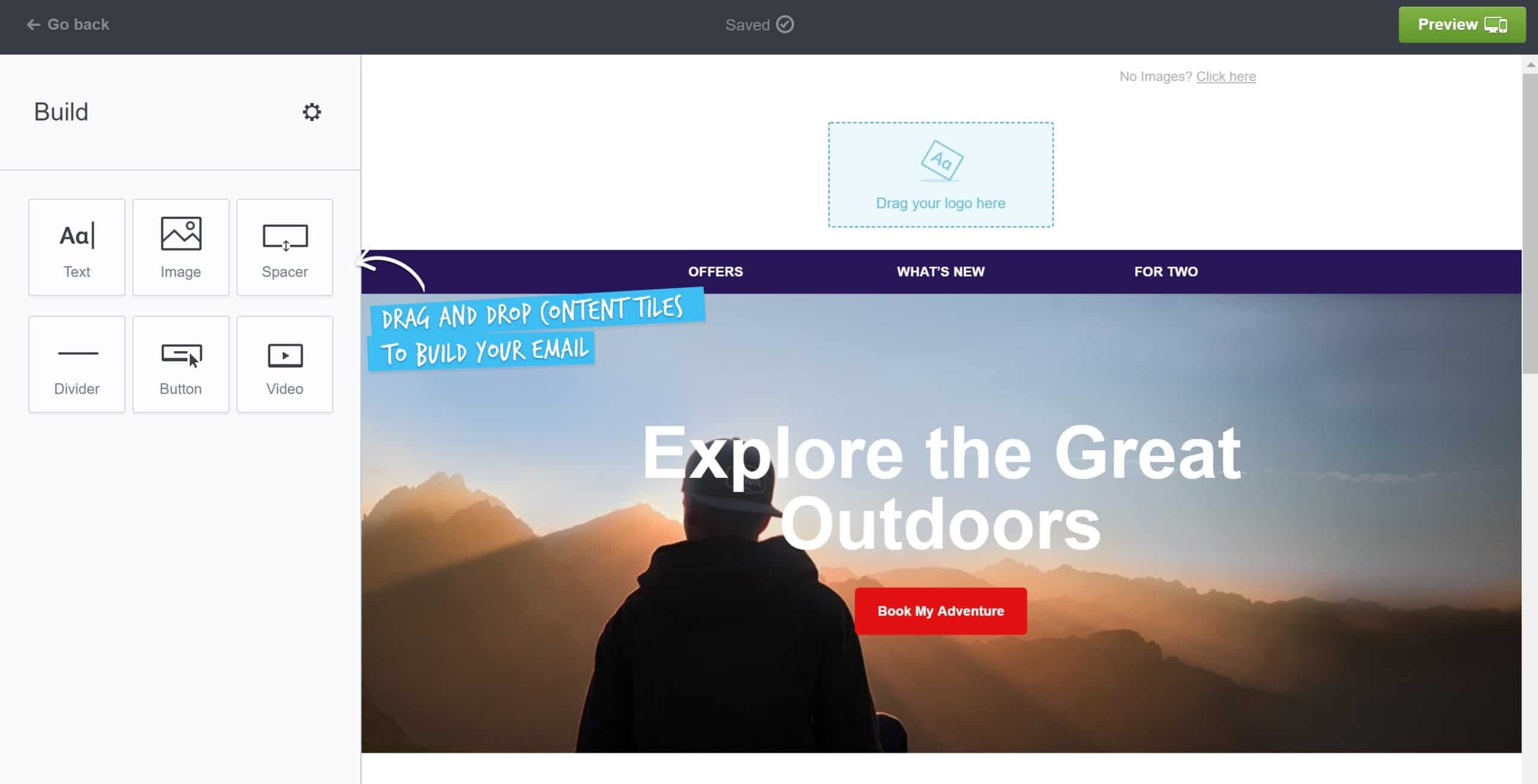
Source: Campaign Monitor
Take the time to pick your different fonts, images, and so on, so that you have all your pieces ready to go, and then simply dive on into the builder. Dragging and dropping the different content tiles allows for full customization, and the best part is that all of our email templates are responsive. This means that they’ll adjust to fit whatever type of device your readers are using, whether it be desktop or mobile.
Here at Campaign Monitor, we have a number of valuable tools to help email marketers to get off on the right foot. Besides our email template builder, you also have access to our:
Wrap up
Huge thanks to Cabel and the team at Panic for allowing us to tear the magic out of their email newsletters once more. Taking the time to examine and learn from campaigns designed by other brands is essential to learning how you can amp up your own marketing efforts.
Learning from and taking directly from are two different things, however. So, while it may be enticing to simply copy your favorite campaigns from other brands, that’s simply unethical.
This is why it’s essential to make note of your weaknesses and start deciding how you can take the next steps to up your game. For some, it may be diving into the technicalities behind CSS and HTML coding. For others, it may be finding design tools, such as our free email template designer, that can help them create quality designs of their very own, without the technical know-how.
No path is better than the other, it simply means choosing what’ll work in your best interest.
Ready to take your CSS game to the next level? Then make sure you check out Campaign Monitor’s Ultimate Guide to CSS.