8 minute read time
Everything You Need to Know About Email Call to Action Words

If you’re satisfied with your open rate but people aren’t converting or clicking over to your landing pages, your email CTAs could probably use some work.
Imagine your email campaign is a movie. Your subject line and preview text would be the trailer, your body copy the rising action, and your CTA the climax where everything finally comes together.
Just like a movie, the climax of your email should be interesting, creative, and attention-grabbing to inspire your readers.
In this post, we’ll go over the basics of creating an email CTA with some best practices, mistakes to avoid, and examples to get it right.
What are email calls to action and why are they important?
Your email CTAs tell your subscribers what you want them to do after reading your email. They link to places outside of your email campaign, such as a specific landing page.
Think of your goal for the email campaign. Do you want people to:
- RSVP to an event?
- Purchase a product?
- Read a blog post?
- Listen to a podcast?
- Watch a video?
- Donate?
Your CTA literally links your email campaign to the place where your subscribers will complete an action.
CTAs are relevant because they drive the ROI behind your email marketing. Thirty percent of marketers say that email has the highest ROI of all tactics. To make it work for your organization, you’ll need an effective CTA strategy to drive conversions and website traffic.
Which is better for email CTAs: links or buttons?
When you write email CTAs, you’ll have to decide if you want to use hyperlinks or buttons.
At Campaign Monitor, we’ve found that buttons deliver a 28% better click-through rate than traditional hyperlinks.
For starters, buttons are easier to spot than standard hyperlinks because buttons are usually designed with bright colors.
Plus, CTA buttons lend well to the idea that online readers scan—they don’t read every word on a page. Headings are essential for guiding scanning eyes down a page, and CTA buttons are like headings on steroids.
We’ve also found that fewer links aren’t always better. Sometimes, you’ll want to give subscribers a few options—remember that not every subscriber will be ready to take action right away.
Notice that, when links go up, clicks also go up:

Source: Campaign Monitor
Take each campaign into consideration. It’s a smart idea to use a single CTA button for your #1 goal and include a few hyperlinks throughout the body copy as extra choices.
8 best practices for email CTA buttons
Your email CTAs have a big job to do getting people to navigate out of your campaign. There’s a lot of pressure to get them exactly right. Follow these tips to make the most of every CTA in every email you send.
1. Choose the right colors in your email calls to action.
Color choice is critical with your CTAs—whether you use hyperlinks or buttons. Contrasting colors grab attention and let people know they can tap the button.
Nielsen Norman Group found that minimalism isn’t the best choice here. “Ghost buttons” that blend into the background color or image confuse readers. Here’s what a ghost button looks like. We found A LOT of them while researching this article.

Source: Gmail
That’s a ghost button.
Instead, choose a color that contrasts with your image or background. Look how Indiegogo uses a bright pink button to go with every link:

Source: Indiegogo
2. Make sure it’s easy to tap or click.
Keep in mind that over half of all emails are opened on mobile devices.
In many cases (14% to 52% depending on age group), a subscriber might first open an email on their phone but wait until they’re on a laptop to complete the action.
Your CTA button or link must be large and easy to tap with a thumb if someone is holding a phone in one hand.
Nike used a large CTA button in black, which stands out nicely against the white background. Note how it’s aligned to the left. That makes it easy for someone to tap with a thumb if they’re holding their phone with one hand.

Source: Nike
3. Don’t be vague in your email calls to action.
Subscribers need to feel confident with your CTA before they’ll feel comfortable enough to click.
Research has found that phrases like “get started” and “learn more” don’t work well because they’re too vague and serve as common clickbait button copy. “Get started” with what? Downloading a report? RSVPing to an event? Creating an account?
Instead, use clear action verbs in first-person that help subscribers visualize themselves completing an action and reaping the benefits. Phrases like “I want to save money now” or “reserve my seat” both build urgency, tout benefits, and give ownership.
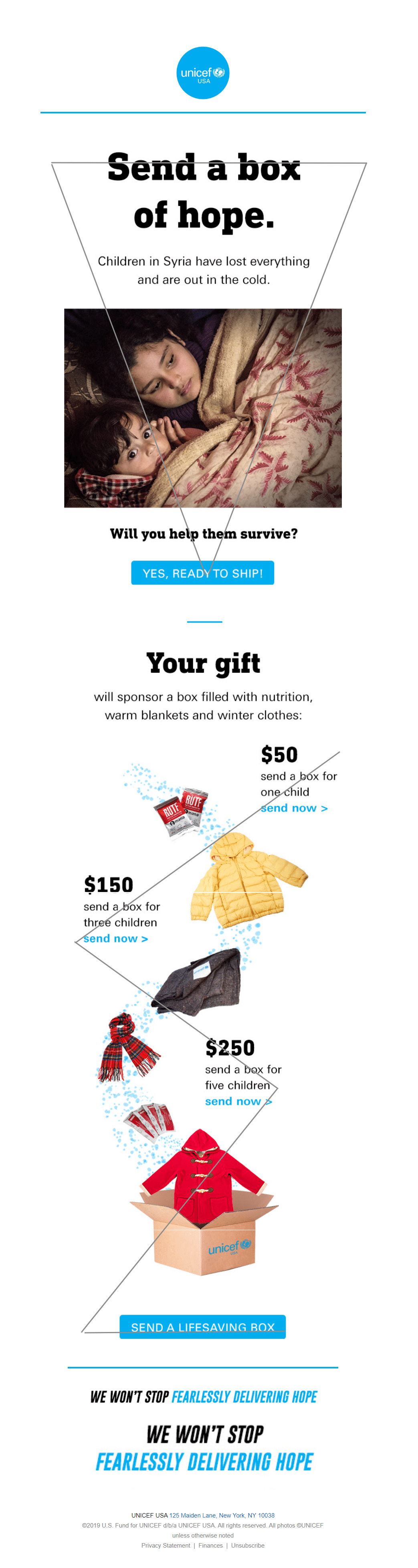
UNICEF uses clear action verbs, a hint of first-person here:
Source: Gmail
4. Draw attention to your CTA button with whitespace and design.
When it comes to web content, people scan in different patterns—they don’t read every word.
And people consume email campaigns even more abruptly than other pieces of content like blog posts. As they scan, people look for key features that tell them when pieces of content are important such as:
- Bold words
- Headings
- Bulleted lists
You can make your CTAs stand out by surrounding them with plenty of whitespace. In the case of hyperlinks, place them either at the end of a sentence or—even better—on their own line.
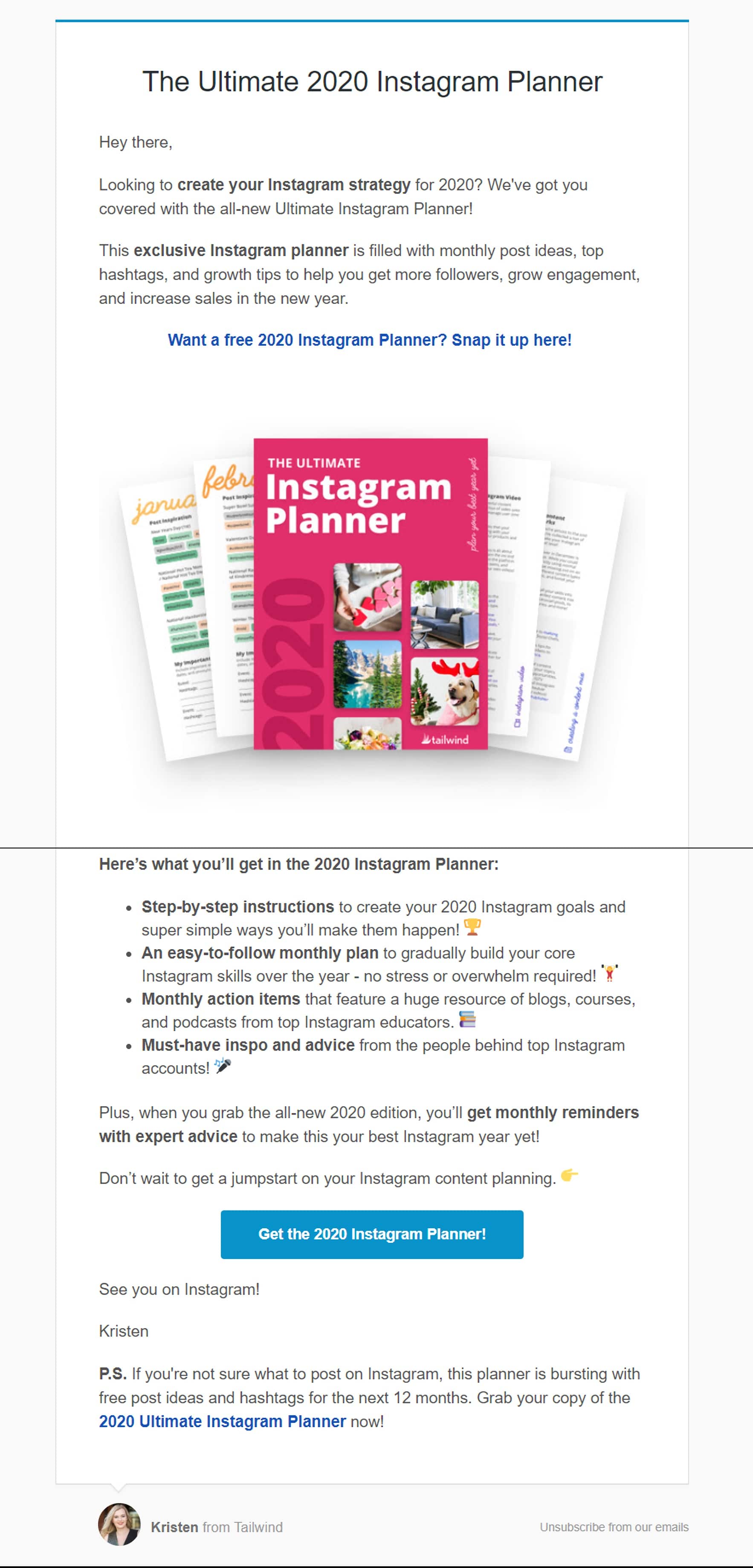
Tailwind included a big CTA button at the bottom here with plenty of white space. The hyperlink towards the top of the email is on its own line in a blue color (an excellent choice for links).
Source: Gmail
Going back to that UNICEF example, do you notice anything interesting about the composition? It’s specially designed to help readers scan. There are an inverted pyramid and Z-shape to guide the subscriber’s eyes down the page:
Source: Gmail
5. Live up to the promise with your landing page.
There are few things more frustrating than clicking a CTA button only to be directed to a confusing landing page or—even worse—a landing page that isn’t at all what you expected.
A link or button is a promise. People expect certain things from you when they tap that button.
Like emails, landing pages should be easily scannable and contain concise copy. Think of them as an extension of your email campaign.
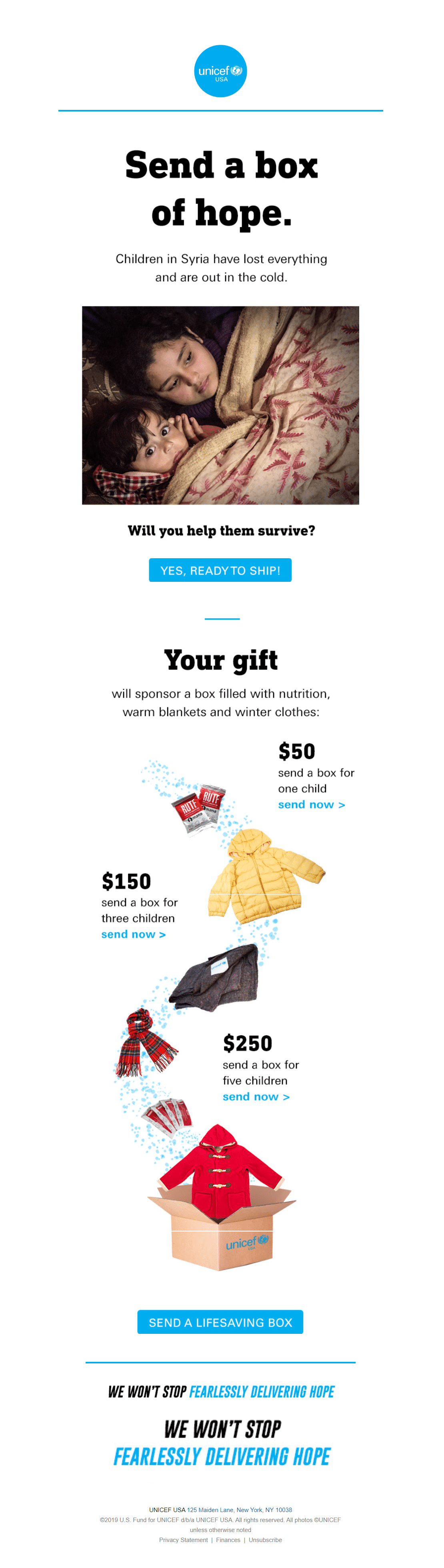
UNICEF’s landing page includes big CTA buttons for subscribers to choose a donation amount along with only 100% necessary content.

Source: UNICEF
6. Avoid friction words in your email calls to action.
Friction words put the burden on your subscribers to complete a task. They include words like
- RSVP
- Buy
- Download
- Register
Instead, use words that highlight the benefit of taking action. “Get your free report” works much better than “register here for your free report” and clearly explains the benefit to clicking the button without scaring the reader off with the labor- and time-intensive word “register.”
7. Stick with a single CTA per email.
Research has found that consumers don’t actually like having too many choices—it’s a phenomenon called the paradox of choice.
When people are confronted with dozens of different menu items, for example, they have trouble deciding. Even worse, they tend to feel unsatisfied with their choice—what if something else is better?
Including a few links is a solid idea to help elaborate on different points throughout your email. When it comes to CTA buttons, however, stick with one single goal and action.
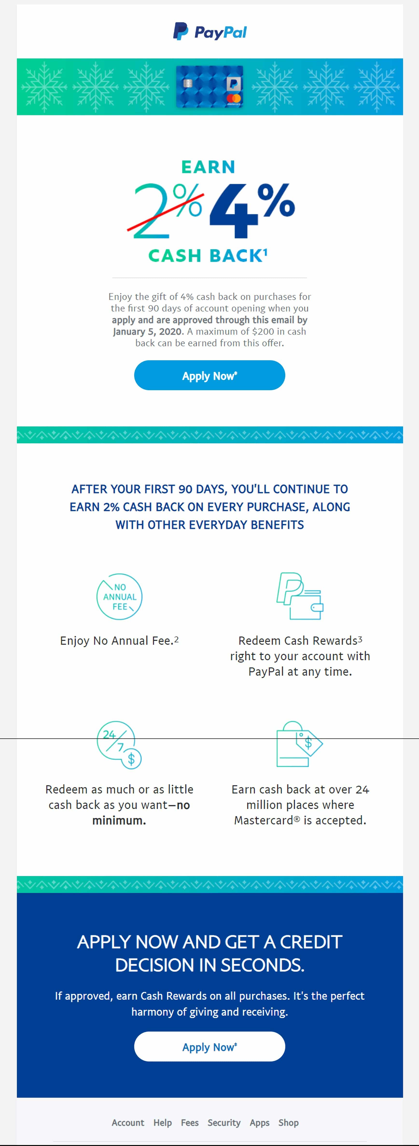
Notice that, while this PayPal email has two email CTAs, they’re both calling for the same action:
Source: Gmail
8. Don’t send the same CTA to your entire list.
Segmented campaigns can drive 760% more revenue than generic emails simply because they’re more relevant. Think about it: It’s much easier to spark the interest of 10 people than 100.
You can segment your list based on unique demographics like age, location, or behavior and give them unique email CTAs. Some subscribers may respond better to “revamp your wardrobe now,” whereas others may prefer “save on your favorite styles.”
To nail down the perfect CTA for each audience, run A/B tests across different segments of your audience.

Source: Campaign Monitor
Wrap up
Email CTAs are your moneymakers. They draw your subscribers’ attention out of the inbox and onto landing pages or even out into the real world. Make sure to keep the following tips in mind:
- Don’t overburden your subscribers with too many choices.
- Avoid friction words that put effort on your subscribers.
- Use bright colors and surround your CTA button with whitespace.
- Make it easy to click or tap from a smartphone.
- Use actionable language and landing pages that live up to the promise.
Looking for more ways to level up your CTAs? Check out these 10 tips to improve your CTAs in email.