8 minute read time
How to Send the Right Message with Your Email Newsletter Design
No matter how good the content is, design can make or break your newsletter. Here are some email newsletter design tips, and how to optimize for conversion.
Any designer worth their salt will tell you good design is invisible, but that doesn’t mean it’s effortless. Your messaging depends on design to be effective. A good email newsletter design is not just attractive; it markedly complements the words you’ve written.
Email templates are a great tool for most marketers; unless you have hours to spend on design and layout, we recommend using one rather than starting from scratch. Drag-and-drop email builders allow you to customize any template to make it yours. In fact, making the changes is often easier than making them look good. Here’s how to turn a basic template into a customized email your readers will love to receive.
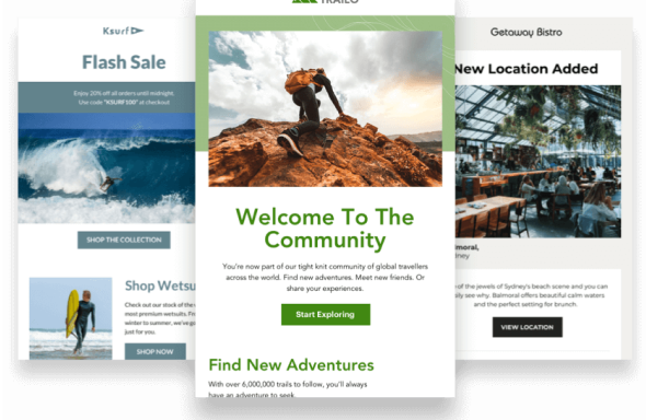
Choose an email newsletter template that fits your content
Have an outline or even your final piece of content ready to go before you search for a template. Otherwise, you may make it through the customization process only to find your template isn’t a good fit. Even templates designed specifically for newsletters aren’t interchangeable.
Your template must-haves will be dictated by the type of email you’re sending. Are you sharing a round-up of popular links? Look for a design with multiple sections and separators. Do you write thought leadership essays? You need a template with a minimalist, text-forward layout.
Design tip: Save templates you’ve used for future newsletters. Consistency makes your marketing campaigns look professional — and you’ll save time by sticking with something that works.
Make it yours by incorporating your branding
A reader should know who an email is from within seconds of opening it. Using brand assets and colors makes your identity clear from the start.
There’s no excuse for sending out an email campaign without your logo or wordmark. Most templates have a section for this at the top; if yours doesn’t, add one. It’s also a good practice to put your logo or wordmark in the email footer.
Your template should also incorporate your brand’s color scheme. Don’t go overboard — there’s no need to include an entire color palette or coordinate every element. When changing text and background colors, maintain legibility by keeping font sizes large and using high-contrast color combos.
Design tip: Double-check your color palette with WebAIM’s Contrast Checker. If your font is a lighter weight than the tool’s default font, you may need to increase contrast to stay within accessibility guidelines.
Chart your reader’s journey with design elements
Design isn’t just about aesthetics. It’s a tool you can use to shape a reader’s experience. Most people scan their email messages, but you can use design to strategically highlight enticing information and earn your reader’s full attention.
Set a hierarchy to highlight key points
Using typography to create a visual hierarchy helps scanners quickly pick out the key message of your email. The size, weight, color, contrast levels, and even shape of your text provide cues that guide a reader’s focus. The longer your email, the more hierarchical elements — like headers and subheads — are necessary to break your content into digestible sections.
Design tip: When creating text styles, don’t go overboard with differentiation. You only need to change one or two elements — for example, weight and size or size and color — to denote hierarchy.
Lead readers through a longer email with eye-catching elements
Your newsletter layout should partner with the visual hierarchy you created earlier to draw eyes from one key element to the next. The inverted pyramid is a great format for short messages with a single CTA; longer newsletters require multiple elements to keep readers engaged all the way through. Try using:
- Contrasting or accent colors for your font or background for a look that’s hard to scan past
- Borders to separate different sections, so readers who scan through one section know where it ends (and the next one begins)
- Text alignment to break the line of your paragraphs and draw the eye to interesting offers, quotes, or arguments
Design tip: If you can’t decide how to best help your readers digest the information you’re sharing, get some design inspiration from these great newsletter examples.
Always highlight CTAs
Your CTAs should be easy to find and interact with, whether your email has one or many. The two most popular CTA locations are above the fold (visible without scrolling) or at the end of your message. Both are natural stopping points in any scanning pattern. No matter the location, your CTA is more likely to see action if it’s a button.
However, buttons aren’t the right choice for every newsletter format. Wrap-ups include multiple links by nature, all of equal importance. Long-form content may have links that support your arguments. In-text links or link collections don’t need to be buttons. They simply need to be formatted in a way that makes them recognizable as links.
Shoot for a simple presentation
The desire to make things too complex is a common design downfall. When you try to draw attention to too many things, readers just get overwhelmed. Including plenty of white space is the best way to make your design pop.
Give your content space to breathe
White space is essential to creating a professional design. It serves multiple purposes: breaking up content into different segments; giving the reader space to absorb what you’re sharing; and balancing out the more eye-catching images, headlines, or CTAs.
Leaving proper spacing and margins between different design and content elements paradoxically brings everything together into a coherent whole. Without sufficient white space, different segments and elements of your email will compete with each other. A tidy-looking email will always look more professional than one where every pixel has been “designed.”
Strike the right balance with image and graphics
The “right” number of images depends on the purpose of your newsletter — a principle that’s true for many tips in this article. The best rule is to only use images when they’re necessary. If your message relies on multiple images or gifs, make sure you follow the best practices for image-heavy emails.
Design tip: There’s no optimal image-to-text ratio. Previous “rules” were based on how spam filters used to work. Senders are no longer penalized for image-heavy emails.
Use graphs, infographics, and other forms of data visualization with caution. These visuals may seem more confusing or overwhelm readers when they’re nested among other content. If you do want a visual to demonstrate your point, use circles, arrows, and other annotations to help your reader understand what they’re looking at.
Don’t forget basic design principles
It’s easy to get caught up in the minutiae of your design and lose sight of the big picture (or the full email). Your last task before finalizing your email newsletter’s design: Double-check your template against the following rules to make sure you’re adhering to best practices regarding accessibility, legibility, and aesthetics.
- Make your email responsive: Any pre-designed template (on Campaign Monitor and most other email tools) comes ready to adapt to mobile devices. If you’re starting from scratch, you’ll need to learn how to make a responsive email.
- Stay within the bounds of the template: Stretching a content zone by overfilling it is the easiest way to make your email look messy and unprofessional. If you can’t fit everything, you need a new template or less content.
- Add alt text to all functional images: Alt text describes the contents of images for readers who use a screen reader or have images turned off. Any functional image — one that’s essential to communicating the message in your email — should have alt text. When it comes to images that are purely decorative, alt text is optional.
- Present key information textually: Since not all readers can view images, keep your important messaging in the email’s text, so no one misses it.
- Keep font and color use minimal: Emails have limited real estate, so there’s not enough room for too many styles. You don’t need more than two fonts (one for headers and one for body copy) or three colors (one main color and one or two accents).
- Use web (or web-safe) fonts: Devices and email clients are designed with unique presets, which means you have two options to maintain the integrity of your design. You can use a web-safe font like Arial or Times New Roman that comes on every device or use a web font that can be displayed by any device.
Good email newsletter design speaks for itself.
Your messaging is only as strong as its weakest element, and design is one of these elements. Colors can influence mood, and fonts can indicate trustworthiness as effectively as any words. The combination of your choices can make your email look professional and engaging or sloppy and worth nothing more than an unsubscribe.
Design deserves just as much time and focus as content. Those of us who aren’t trained in it may have to work a bit harder to get the desired effect. The lessons of those who have come before us (and the newsletter design tips in this post) can guide you toward a design that’s as powerful as your content.