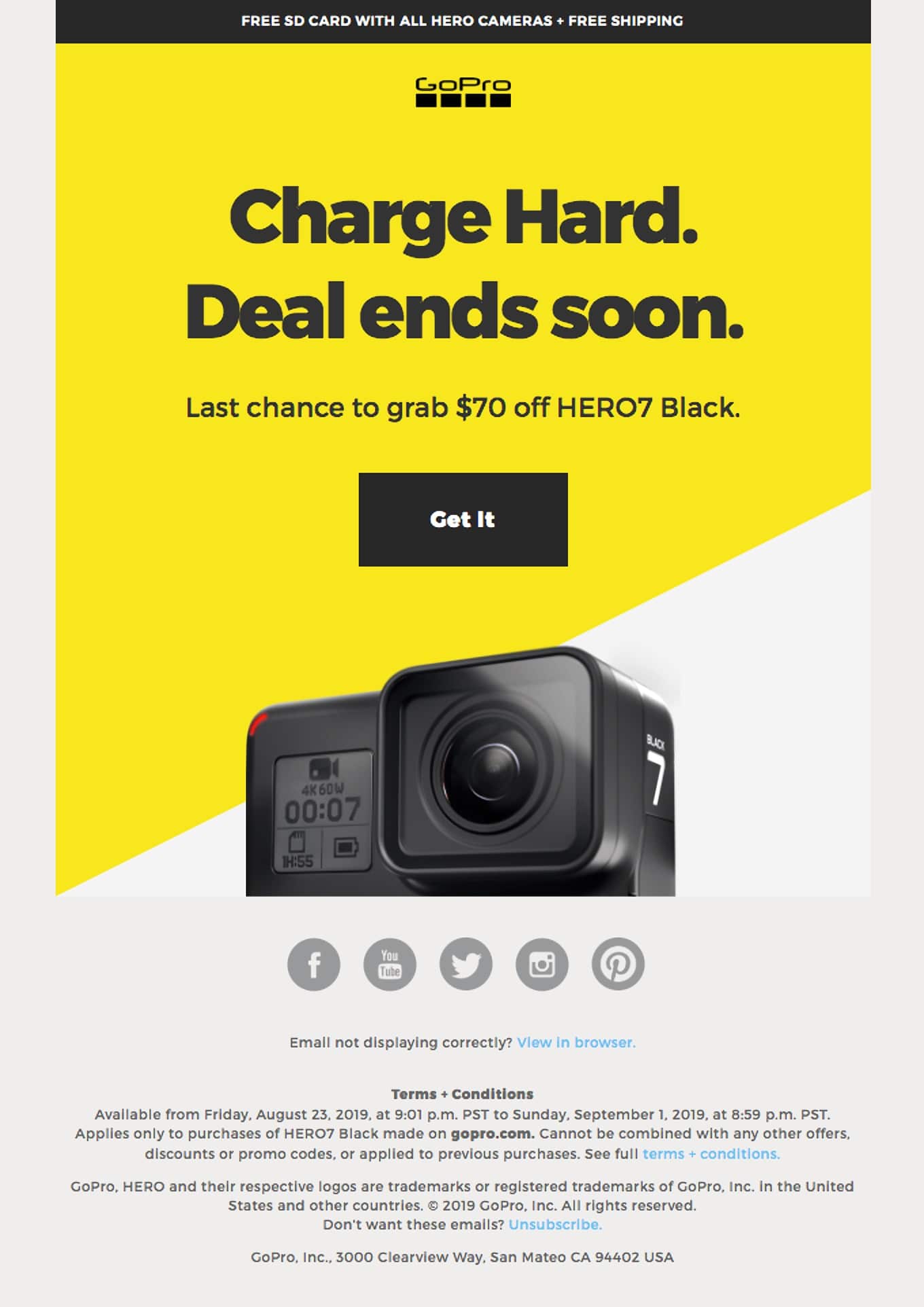
You’ve planned and created your best email campaign yet and you’re excited to hit “send.”
Now, before you do, ask yourself this question, “Did I remember to include an actionable CTA?”
We don’t mean a simple “buy now” CTA. If you want your CTA to be truly effective, you must know how to write your CTAs to fit your campaign.
Common CTA strategies include “Buy now!” or “Visit today!” However, to make your CTA truly stand out, you need to stay up to date on CTA writing and design best practices and take some time to learn from outstanding, real-world examples.
How to write your CTAs: It will affect the success of your campaigns.
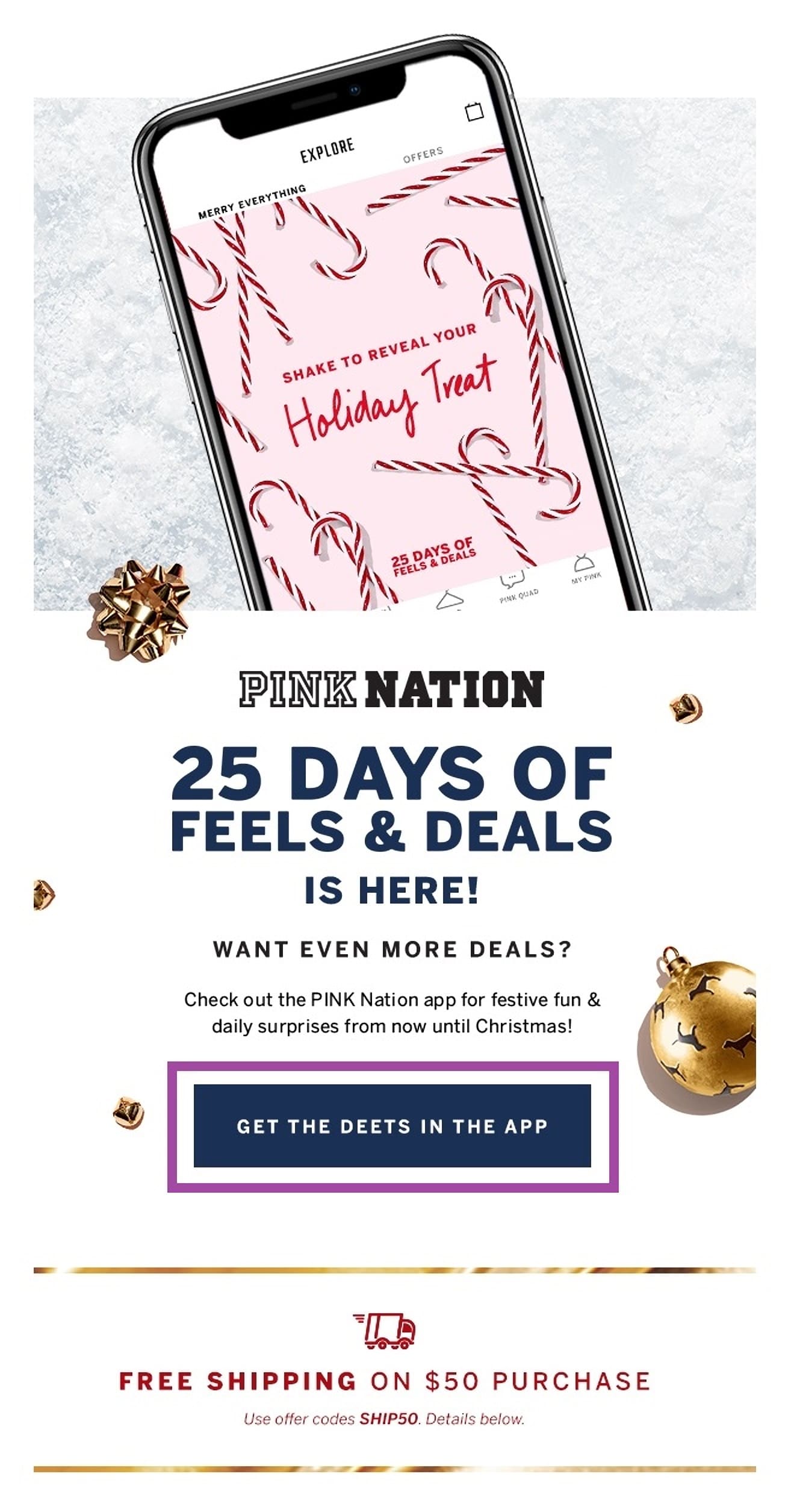
Each of your email campaigns serves a purpose. Without a CTA, your subscribers have nothing to act on, leaving your emails nearly useless. Having either a hyperlinked CTA or a clickable button CTA gives your readers a chance to act on something, such as:
- Downloading a freebie
- Clipping a virtual coupon
- Heading over to your shop to browse
Source: Gmail/Victoria’s Secret
Without these CTAs, there is, again, nothing for your readers to act on, making your emails nothing more than a digital piece of information—which isn’t necessarily a bad thing. However, you won’t get the ROI you’re aiming for without an actionable CTA.
Learning how to design and write your CTAs can make or break your campaign.
Taking the time to learn how to write your CTAs and design them can make a significant difference in the overall success of your email campaign. From placement to color choices and choosing between hyperlinked CTAs and button CTAs—they all play vital roles in not only whether your readers will choose to interact with your CTAs, but whether your readers will even notice them.
That said, here are some interesting facts regarding CTA creation and use in email marketing:
- Forty-eight percent of brands choose to match their CTA to a color that they used in their brand logo – Really Good Emails
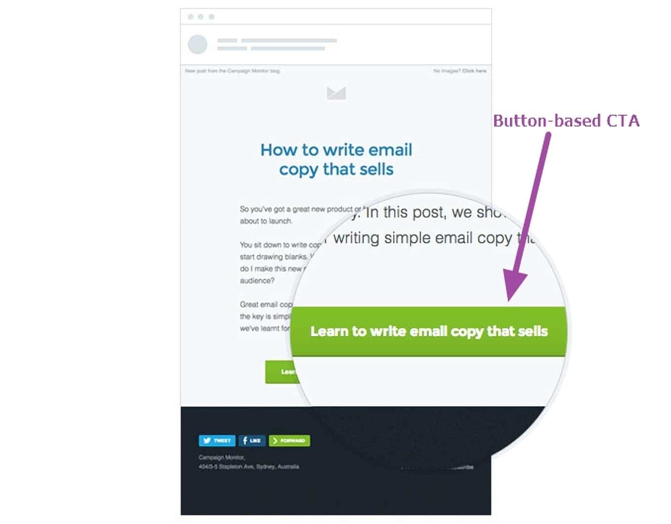
- Button-based CTAs can improve click-through rates by 28% – Campaign Monitor
- Benefit-focused copy in a CTA button can increase click-through rates by nearly 10% – Campaign Monitor
- First-person text in a CTA can increase clicks by almost 90% – Campaign Monitor
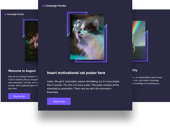
Source: Campaign Monitor
Having a CTA in your email marketing campaign can make all the difference. However, merely slapping in a traditional CTA simply won’t do it anymore. That’s why taking adequate time to learn how to write your CTAs and how to design them is crucial.
Learning how to design your CTAs effectively
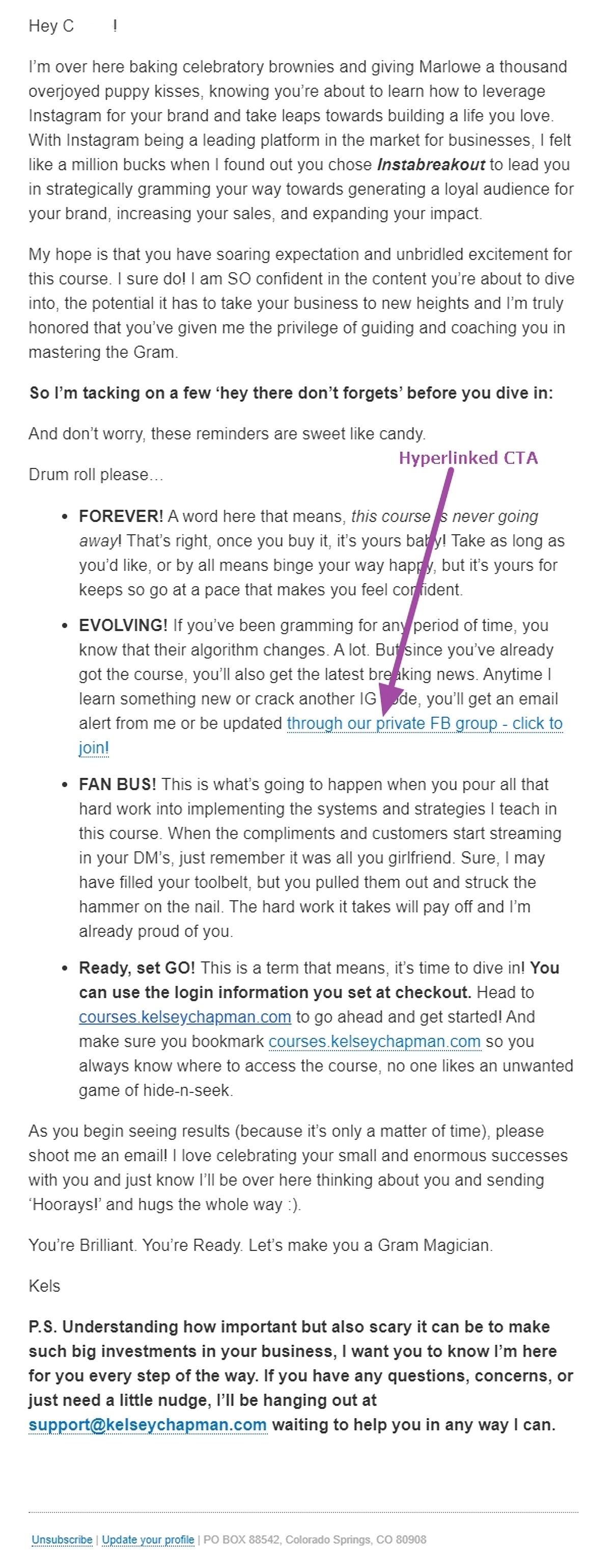
Traditionally, email designers put little thought into designing the actual CTA that was included within the body of an email campaign. For many years, this was simply left to the writing team because hyperlinked CTAs were the way to go. In many cases, these CTAs are still perfectly acceptable. For example, in the case of this welcome email from social media guru, Kelsey Chapman.
Source: Gmail/Kelsey Chapman
As we move into a new century, technology is changing, and with it are consumer preferences. That’s why it’s vital to know not only how to write your CTAs, but how to design them as well. So we’ve compiled an essential list of the most crucial CTA design best practices that you should keep in mind during your email design phase.
CTA buttons perform better than hyperlinked CTA text.
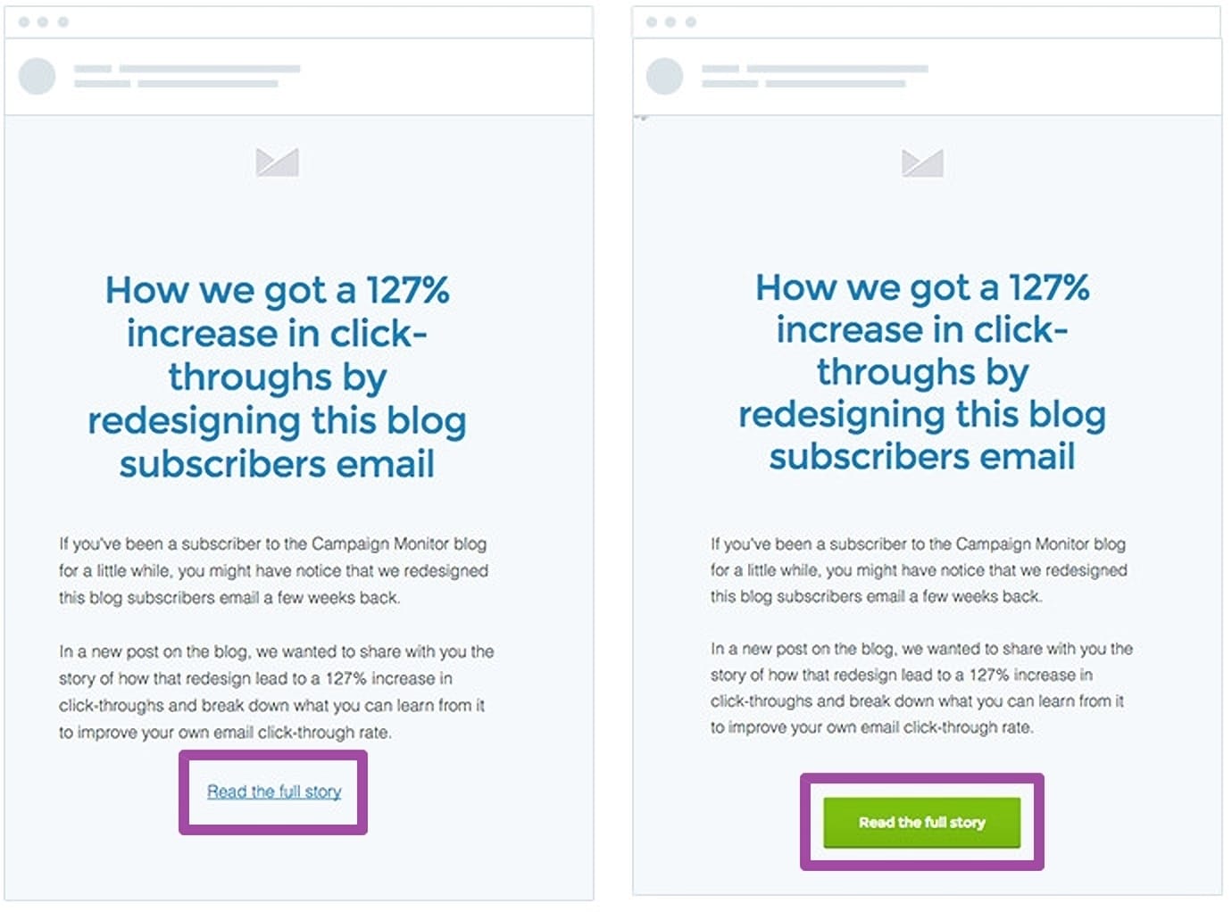
While hyperlinked CTA text is still a viable design option, brands have noticed that consumers prefer a clickable button CTA over a hyperlinked CTA. In fact, during our own research, we found that simply adjusting our CTA in one campaign from hyperlinked text to a clickable button increased our overall click-throughs by 127%.
Source: Campaign Monitor
Make sure your CTA is clearly identifiable.
One reason why consumers prefer clickable CTA buttons is that they’re much easier to find than hyperlinked text options. Unfortunately, while using a hyperlinked CTA is still common practice, many brands leave the text in the same color as the rest of the email text. This makes it nearly impossible to identify quickly.
Here’s the thing: Only a handful of your readers are going to take the time to read your email. The rest are going to scan for important information, including the CTA button. If it’s not easy to spot, then your readers are going to move on without a second thought.
CTA placement is vital.
Since more consumers are spending time scanning their emails for relevant information, it’s vital to consider the placement of your CTA within the body of your email. While many brands include their CTAs at the end of the message, you want to place your CTA above the fold.
Above the fold means within the first viewing window your readers get after opening your message. The more scrolling a reader has to do, the less likely they are to find and click on your CTA.
Source: Really Good Email
Learning how to write your CTAs effectively
Now that you’ve gotten a chance to review some CTA design best practices, adopt the same philosophy into how you write your CTAs to get the most out of each campaign.
Always include action-oriented text.
Remember, the entire point of your email marketing efforts is to drive action. The most effective way to do that is by always including action-oriented text within your CTA. Popular action words for CTAs include:
- Try
- Buy
- Get
- Order
- Reserve
- Download
- Add
- Sign up
- Register
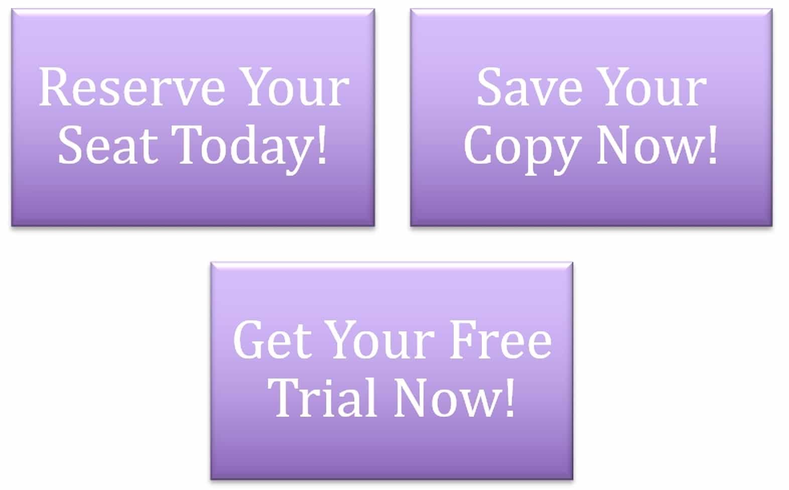
Source: Self-made
Avoid “friction words.”
While you want your CTAs to be actionable, you also want to make sure you avoid the use of friction words. Friction words are either words or phrases that imply your reader must do something that they may not really want to do. Some common friction words that are traditionally used in email marketing CTAs include:
- Submit
- Order
- Download
While these are all actionable words, they tell the reader what to do instead of encouraging them. Here are various ways you can alter your CTAs to include frictionless words:
- Download – Get
- Order – Reserve
- Apply – Learn
Source: Really Good Emails
CTA text should be both large and legible.
When designing your email CTA, we mentioned that you have to make it easily noticeable. The most effective way to do that is by making sure your text is both legible and big enough to stand out. However, that doesn’t mean you want to make it obnoxious.
Take this example from Resy. Their CTA is very legible, thanks to the font and coloring they chose during the design phase. They took it a step further by choosing to bolden the text. Notice, however, that it doesn’t look clunky or out of place.
Source: Really Good Emails
The best way to make your CTA bold and legible is by choosing a font that matches your text hierarchy. To do this, choose something similar to the fonts that you used for your heading text.
Keep CTA text short and sweet.
Along with having a bold, legible CTA comes one that’s both short and sweet. At this point, your reader should already understand the benefit of clicking on your CTA, so you want to keep the text short and simple. Ideally, your CTA will only be 3-5 words in length. Anything more than that begins to look too messy.
First person/personalization goes a long way in your CTA.
Now, adding first person into your email CTA doesn’t have to be complicated. In fact, it can be as simple as saying “Reserve my seat” instead of “reserve a seat.” Studies have shown that simply changing this one word in a CTA can increase clicks by nearly 90%, a number that warrants consideration.
If first-person doesn’t really sound right in your mind, then simply personalizing with the second-person point of view works great too. So, instead of “reserve a seat,” you can opt for “reserve your seat.” This added touch of personalization makes your call to action that much more inviting to your subscribers.
Source: Really Good Emails
Wrap up
Knowing how to write your CTAs is a vital part of your email marketing process. Again, if you want to see the ROI from this marketing strategy, you have to give your email subscribers something to do.
When it comes to your email CTAs, you’ll want to keep in mind some of the design and writing tips we’ve minted, including:
- Include action-oriented text
- Avoiding “friction words”
- Using a button vs. hyperlinked text
- Keeping it short and sweet
Looking for a little more guidance on how to write and optimize your email CTAs? Then make sure you check out our email CTA optimization guide today.

