20 minute read time
Email Design: The Best Practices Guide (+ Bonus Checklist)

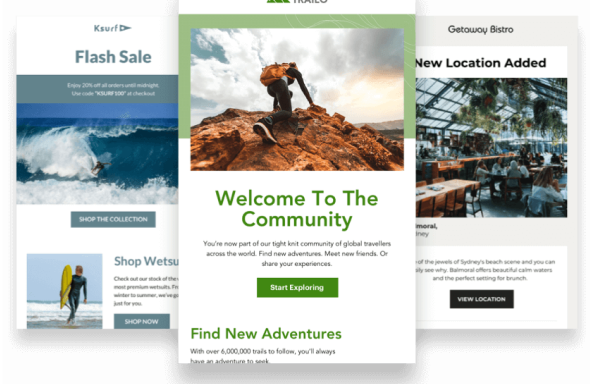
Want an email that looks awesome and converts like crazy? We joined forces with the talented crew from Really Good Emails to take the guesswork out of designing an excellent email with this email design guide and checklist that’ll make every email you send more awesome.
In this guide, we’ll cover email design best practices for all the different elements of your email campaigns and have a bonus checklist for you at the end. So let’s get to it.
Subject Line
While not a traditional “design element” your subject line is considered one of the most important factors in getting your email opened so your subscribers can see your sweet design so make it engaging, personal, and relevant. Remember, that overuse of CAPS and unnecessary punctuation, as well as some words, can trigger spam filters so respect your subscribers and don’t go there. Use these words instead.

Bonus: CoSchedule has an excellent Headline Analyzer that could also be applied to email subject lines.
Is longer better?
When it comes to email subject lines longer isn’t necessarily better. It’s important to keep in mind that your subscribers use a variety of different browsers and email clients as well as mobile devices to consume your emails.
According to data from Return Path, 65 characters seems to be a sweet spot for email subject lines, which is about 15 characters more than the average subject line. When subject lines are 61-70 characters long, they tend to get read. However, most email subject lines are between 41 and 50 characters.

What about symbols in subject lines?
The saying “a picture is worth a thousand words” may never be more true than when it comes to emoji. And emoji in email subject lines can have a major impact. Not only can they take the place of words, be attention-grabbing, and add a definite charm, they can increase your open rates. A report by Experian noted that fifty-six percent of brands using emoji in their email subject lines had a higher unique open rate. Consider us ?.

Things to keep in mind when using emoji in email
If an emoji isn’t supported in the email client, the recipient may see a ☐ character instead.
Remember: Gmail has to have some extra special considerations when using emoji. You may notice in Gmail when you use emoji in the subject line the icon will look different in the inbox view and after the email has been opened. This is due to the inbox view using the Android version of the emoji, meanwhile, the opened email view uses Google’s own emoji style. While the emoji basically look the same, it’s still worth testing to make sure the same sentiment is expressed in both versions.
In addition, for Inbox by Gmail, it’s currently not possible to insert emoticons in Inbox messages using the browser version.
Preheader
Your preheader can be visible in the inbox preview and in the body of your email, or just in the preview pane if you want to save email real estate. Preheaders add valuable context to your subject line and can help your open rate. Keep it short (between 40-70 characters) and to the point. Use this space to help your customer know why the email is useful to them. Your subject line and preheader text should work together.

Personalization
Emails with personalized subject lines are 26% more likely to be opened. Go beyond just using your subscriber’s name in the subject line and use other data you have to fuel super relevant messages.

Adding company name, last purchase, or other information helps you to personalize the email in the perfect way for each subscriber. But really good personalization involves more than just injecting a first name. Think about how you could completely change the email based on someone’s information.
Stop thinking of emails as one-to-many and think about them as one-to-one—where each email is customized to each subscriber.
Humanization / Contextual Marketing
A term that’s been getting popular is contextual marketing or humanization which focuses on making the email more of a 1-to-1 engagement rather than a 1-to-many type email that’s one-size fits all.
This leads to emails specifically tailored to the subscriber which will lead to higher engagement.
Spotify is a great example with their year-end campaign showing each subscriber what their most listened songs were and where they ranked in their favorite artists’ fan rankings (based on how many times they listened to their music).

Making your email feel more “humananized” and like it was built for each subscriber has many benefits including increased engagement, better relationships with your subscribers, and even people getting excited to receive and open your email.
Dynamic Content
For those wanting to get serious with personalization, you can also dynamically change entire sections of content within your email to make the entire campaign more relevant and more appealing to subscribers.
A common use case for this would be showing menswear to your male subscribers while showing womenswear to female subscribers. Check out how Adidas did it in this email:

Email Layout
Your email layout should help the viewer know what they should check out first, and where they can go from there. They should be able to scan the email quickly using a logical hierarchy with large headlines and images focusing the attention. Use layout to break up space and help create chunks of content.
Inverted Pyramid
We’re big fans of the inverted pyramid model. It’s essentially a framework for structuring the elements of your email campaigns (headers, imagery, buttons, etc) so they work together to draw people in, deliver the key messages of your campaign and get them to click-through.

By guiding a subscriber’s eye down the page to your CTA, you’ll encourage them to click through to explore more of what you have to offer, resulting in better brand awareness, more web traffic, and ultimately more sales.
Zig-Zag
Another effective design grid is an angular one with a zig-zag layout.
According to the graphic designer, Mary Stribley, an “angular layout is both enticing to look at as well as functional to order lots of information and imagery.”
You can create these angles through using imagery or color blocking in order to guide the reader through each step of the email. This not only creates a visually pleasing layout, it also helps to simplify each section of the email so that it is easy to read.

One Column
One column emails work great on desktop and mobile. These mobile first emails usually adapt to desktop and scale images. It helps consumers navigate the email without overwhelming them. The one column design makes it obvious what information is important and what you want a consumer to do next.

Email Width
To ensure that your email renders well in every email client, we can push the envelope on our email widths to at least 640 pixels. At widths wider than 640px Gmail doesn’t show any background color that would appear in the margins at most reasonable browser sizes (you can see them if you stretch your browser to wider than 1200px). For our designs, 600px is usually the sweet spot.
Plus, email clients don’t use the full width of your screen to display an email message. Some show ads or have navigation or a menu so there are limitations to the real estate on a screen.
Images
When using images in your emails, it’s important to keep the following in mind:
- Dimension – most emails are 600-640px wide. However, to keep your image crisp on high-resolution displays, you need to make your image 2x the size (ie. 1200px) and use the image attributes and CSS to keep the image at the width you want.
- File Size – It’s easy to forget about file size in an email but you want to make sure your images are optimized. Especially since more than 50% of emails are opened on mobile devices. The bigger the email, the longer it’ll take for mobile subscribers to view and thus create a negative experience with your email. Read more about best practices for image-heavy emails here.
- Alt Text – If your image doesn’t load or breaks somewhere along the sending process, Alt Text is the text that will display in its place. This is another area that many email marketers overlook. Add in helpful Alt Text that adds to your message in the case that your image doesn’t load. If your image has text on it, I usually write the overlaying text as the alt text. This way if the image doesn’t load, the text will still be read. Including ALT text also makes your email more accessible.
- Use images that complement the email – Your email should not be a bunch of images placed together. An image should add to the email and messaging—not be the messaging. A simple way to test this is to view your email with images turned off. Does the email still make sense? Is the message still clear? Our friends at Email Monks offer some solid advice on the optimal text to image ratio.
- Stock Images – Stock imagery can sometimes take your audience out of the messaging. Keep your images on brand and genuine. Take the time if you have the opportunity to create specific imagery for your email campaign! If not, use imagery from paid sites like stocksy.com or free sites like deathtothestockphoto.com. Here are a few more to check out.
Images and Alt Text
Alt text is simply the alternative text displayed with an image. Think of it as the backup text that provides some context about what your image is, for those that have images blocked or turned off by default. Many marketers learn about alt text the hard way by forgetting to use it and suffering the consequences. Don’t be that person.
As you can see from the example below, when images are blocked, subscribers see what looks like a broken image, or a red “X”. In this case, alt text indicates that there is an image and provided a little context about the image to encourage subscribers to “turn on or enable” images in the email.

For more on Alt text check out our design guide and this post by our pals at Litmus.
Web Fonts + Fallbacks
When it comes to email marketing, it’s best practice to use web fonts wherever you can, however, it’s important to keep in mind, that not all email clients offer universal support for web fonts.
Example: Uses @import + @fontface to bring in Clobber, Gotham Book, Gotham Medium, and Montserrat fonts.

Google Fonts is a great resource to add web fonts to your emails. We suggest using live text when possible for better legibility across devices and consistent brand experience from email to website to add web fonts to your emails.
@import
@import url https://fonts.googleapis.com/css?family=Open+Sans
Currently, the @import method is not supported in AOL using IE11 and Android 2.3.
<link>
<link href=”https://fonts.googleapis.com/css?family=Open+Sans” rel=”stylesheet” type=”text/css”> The <link> method is fully supported among the email clients listed above. Web font services will provide you with the href value to use for your web font of choice. If you’re hosting your own web-font, you’ll have to change the href value to where you’ve hosted your web font.
@font-face
<style type="text/css">
@media screen {
@font-face{
font-family:'Open Sans';
font-style:normal;
font-weight:400;
src:local('Open Sans'), local('OpenSans'), url('https://fonts.gstatic.com/s/opensans/v10/cJZKeOuBrn4kERxqtaUH3bO3LdcAZYWl9Si6vvxL-qU.woff') format('woff');
}
}
</style>
Think of the @font-face method as a direct-to-the-source sort of method of importing your web fonts. It can be more reliable to import the web font directly from the source as you can choose which format of web font you want to import. Especially if you’re given a choice, which some web font suppliers do have.
If web fonts are not supported there are fallback fonts that will be seen instead. When setting fallbacks, remember to use a “web safe font”. System fonts like Calibri are not always supported across all clients.

Each email client also has a preferred or default font which users would see instead of your chosen web font. The three most popular desktop email clients have the following defaults:
Apple Mail = Helvetica
Gmail = Arial
Microsoft Outlook = Times New Roman
Outlook is a special case. If a webfont fails in Outlook, it ignores the fallback fonts and just decides to render everything in Times New Roman. If this happens, add this CSS to your email and you should be good to go.
<!--[if mso]>
<style type="text/css">
body, table, td, p, li, a {font-family: Arial, Helvetica, sans-serif !important;}
</style>
<![endif]-->
Add other elements like p, li, a, etc. if you need to fix Outlook rendering Times New Roman on those elements too.
For more help implementing web fonts in your emails, check out our guide here.
White Space
White space is the blank area around your paragraphs, images, and call to action buttons.
Adding ample white space around the elements in your email encourages click-throughs by separating them visually from other elements in your email and helping focus the reader’s attention on them at the right time. It can also increase the legibility of your email and improves the eyes’ ability to follow the content. Use your best judgment to ensure your copy and CTA button are separated enough to stand out, but close to enough that your readers know they’re connected.
Mobile Optimization
Email opens on mobile devices just keep increasing year after year. The latest stats are that over 68% of email opens occur on mobile. Making your emails mobile-friendly is easier than ever by:
- Using a mobile-friendly template
- Keep your subject line short
- Use preheader text
- Use minimal body copy
- Use one clear and easy to click CTA button (According to a recent MIT study, the average size of an adult index finger is between 1.6cm and 2 cm, which translates to between 45 x 45px and 57 x 57px on a mobile device.) Multiple CTAs can be confusing and lead to overwhelm, which you definitely want to avoid.
- Increase the size of body copy if it’s small on desktop emails. (16px is a good size for mobile)
- Make sure your images aren’t too small or hard to see when on mobile
Coding Mobile Emails
If you are coding your emails, there are two approaches to mobile emails: responsive and hybrid.
Responsive
Responsive uses media queries and CSS to override the existing styles when the email is viewed on a small display.
@media screen and (max-width: 480px) {
.responsive-table {
display: block;
width: 100% !important;
}
.responsive-image {
height: auto;
max-width: 100% !important;
}
}
Hybrid
Hybrid gets a little more complex but relies on using a fluid layout that will shrink and grow with the size of the display. Plus, it doesn’t rely on media queries which can be a big bonus if you’re targeting email clients that don’t support media queries.
CTAs + Bulletproof Buttons
An ideal CTA button has three main aspects that work together to create an effective conversion point for the reader:
- Copy – be specific and focus on the benefit
- Design – stands out, appropriately sized, has whitespace around it
- Placement – the ideal placement of the CTA button is relative to the complexity of the offer. If the offer is more complex, you may need more explanation copy before the CTA.
It’s always good to have a couple different button types for different priorities in your email. For example, having an orange button with white text for your main CTAs and light gray buttons with dark text for secondary elements. However, it’s important to keep the number of CTAs to a minimum in your email. Focus on where you want people to go and remove any unneeded noise. Here are some things you should consider when crafting your button:
- Size – Keep your buttons big enough that people can tap on them on their phone. Typically that means around 50 pixels tall.
- Color – Most brands match the color of their button to their brand’s colors, contrasting against the background color and the space around it. Hover effects (changing color when one scrolls over) is supported by most email clients and is being used more often.
- Frequency – The number of buttons you have in an email is determined by how many actions are possible to take. For retailers, that may be multiple products with each have their own button. For others, that may be just one to focus on the most important message.
- Language – The button is there for viewers to take action, so an active verb is typically used to help them take that action.
Because many email clients will block image loading by default, designing your buttons as images can have a negative effect. Using a “bulletproof button” (a small snippet of HTML and in-line CSS) will ensure that your button is rendered when images are turned off. You can use this tool to create one:
Links
Check every link in your email on mobile and desktop. Things to look for include if it goes to where you wanted it to, does it have UTM tracking, is it clear in the email that it’s a clickable link, are any email browsers changing the color of your links?
Also, keep an eye on dates in your email. Even though you don’t link them, Gmail and Apple like to “help” by turning them into blue clickable links. You can use CSS to override the link style to look like regular body text.
How to stop Apple from making links blue:
a[x-apple-data-detectors] {
color: inherit !important;
text-decoration: none !important;
font-size: inherit !important;
font-family: inherit !important;
font-weight: inherit !important;
line-height: inherit !important;
}
Video
It’s common to think that when you use video in email, that the video will simply play, right inside the email. That would be a magical thing, much like a rainbow unicorn, but many email clients like Gmail, Outlook, Thunderbird, and others don’t support the technical requirements needed to play video inside the email.
But over half of email clients support HTML5 so you can definitely embed video in your email or many ESPs enable you to have a static image with a play button that links to the hosted version of the video. You can also use an animated GIF instead.
Pro Tip: Use a video thumbnail with a play button or GIF teaser of the video to get more clicks.
GIFs
Animated GIFs are a great alternative to using video if you want to add moving content to your emails.
Animated GIF files can get rather large the more animation, frames, and colors there are in the image. To keep them as small as possible, only animate what you need to animate, keep it short, and don’t use every color in the book.
It’s a good idea to keep your GIF file size as close to 1MB as possible. Under is perfect. A little over is still okay too.
Copy/Tone
Understand your audience to know what kind of language will work best. Some subscriber lists are more formal whereas other are casual and okay with the odd profanity inclusion (tread lightly here unless you are one hundred percent sure your audience can handle it.) Writing a high-performing email campaign isn’t hard if you stay true to your brand and optimize the key parts of your email.
Spelling/Grammar
Always send a test of your email to at least two other people who can check your email top to bottom with fresh eyes and look for typos, grammatical errors and other mishaps. You can use this preflight email checklist to avoid common errors before you push send.
A/B Testing
A/B testing can be applied to many components of your email but the subject line is one of the most popular, and easy things to test. Most ESPs make this super simple and include it as part of their system.

Some interesting things you can test in your subject lines include:
- Length – Test short subject lines vs. longer subject lines (this is the topic of much debate in the marketing world)
- Topic – Test two completely different topics as the subject line, to see what content is of most interest to subscribers
- Personalization – Add personalization to identical subject lines to see if a first name greeting, for example, gets a better response.
- Promotion/Offer – See what kind of promotion works best by offering “Free Shipping” vs. “15% Off”
Bonus: CoSchedule, uses Campaign Monitor to send their popular email newsletter The Content Marketing Update. See how they systematically A/B test email subject lines to find out what works for their audience. And get the free guide to A/B testing your campaigns.
Footer
Legal
Your email will need at least the address of the company which is sending it and an unsubscribe link to be compliant with government regulations around the world. Your legal team will probably want to add in some other information such as terms and conditions too if it applies to your messaging. It is always good to get a sign-off from a manager or counsel to make sure that you have everything necessary to protect your rights.
Social Links
Even though it will be a small percentage of clicks from your email, it is always a best practice to show your audience where else they can follow your company. Each social media platform has its own purpose, which your email may not be satisfying. Select the ones that your company uses the most (there’s no need to show every single social profile your company has). Social icons that match your branding or the rest of the email is a nice touch.
Be sure to show the difference of social share vs. social page icons.
App
Consider including a link to download your app if you have one.
Referral
Want to spread the word about your product or service? Include a referral link section of your brand has an incentive program set up. It’s a good module to include in transactional emails.
Support
Contact us or support links. Ask for feedback about the email. If your email is a noreply@ then give your customers a clear way they should reach out to you. Shows brand has a customer support focus and gives customers the opportunity to speak up about their experiences.
Bonus: Email Design Best Practices Checklist
Keep these 16 email copy and design elements in mind, and you’ll nail your email design like a pro.
- Personalized engaging subject line.
- Short concise pre-header text.
- Cull audience data to customize email elements.
- Use dynamic content to segment subscribers.
- Mock up your email design.
- Adhere to best practices for ideal width.
- Keep user experience (UX) top of mind.
- Select relevant images. Make sure they’re crisp.
- Embed a video or animated GIF.
- Follow brand guidelines.
- Add ample white space.
- Use web fonts. Set web-safe fallbacks.
- Prepare a mobile-friendly template.
- Create calls to action (CTAs) designed for click-throughs.
- Add UTM tracking code.
- Don’t forget the footer. It keeps you in compliance.
Use the tips in the post along with this email design checklist for every email campaign you send.

Wrap up
Designing really good emails is easy when you follow the tips in this email design guide and checklist. For more awesome email marketing design tips check out our resources at Campaign Monitor & Really Good Emails.